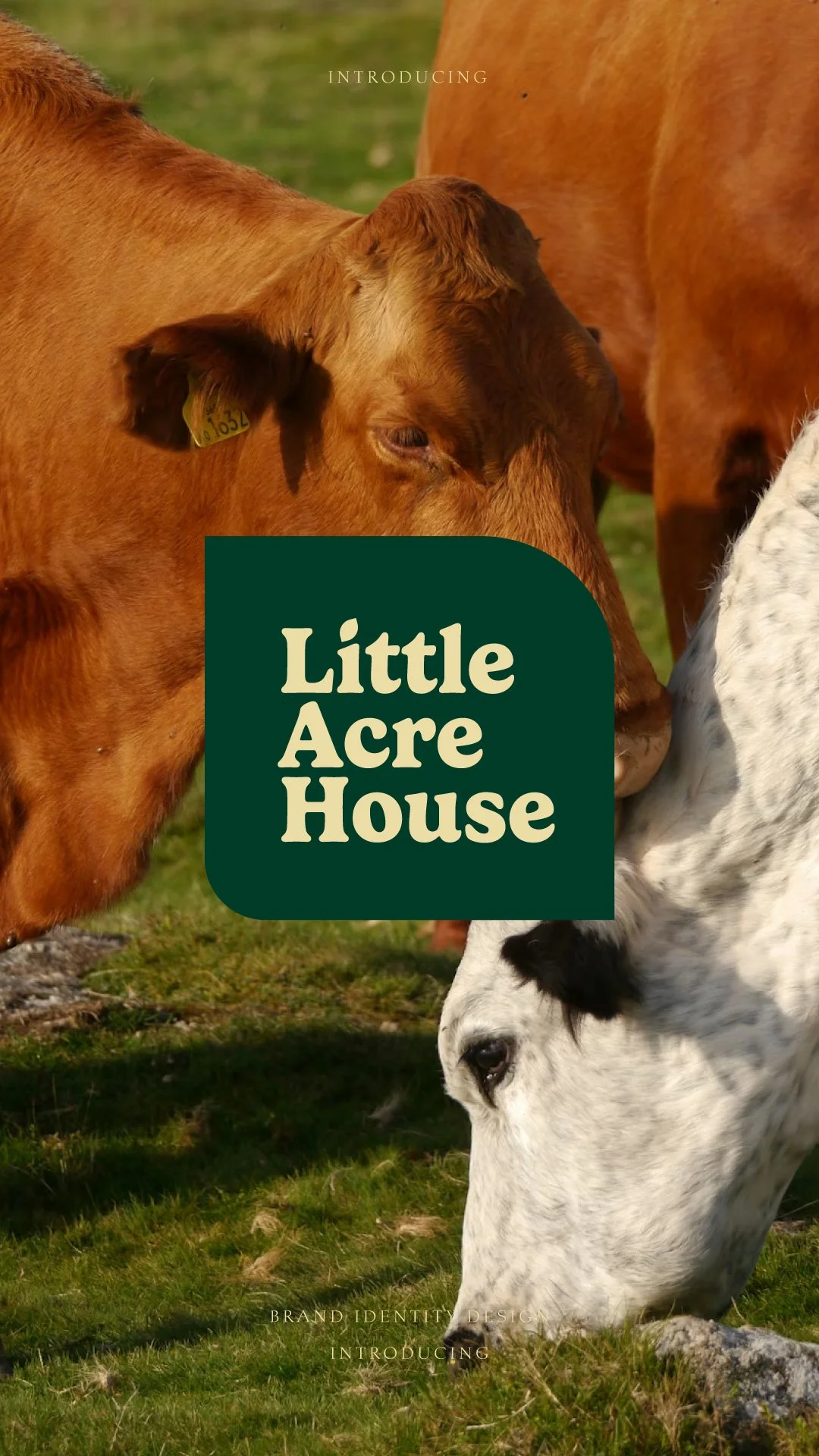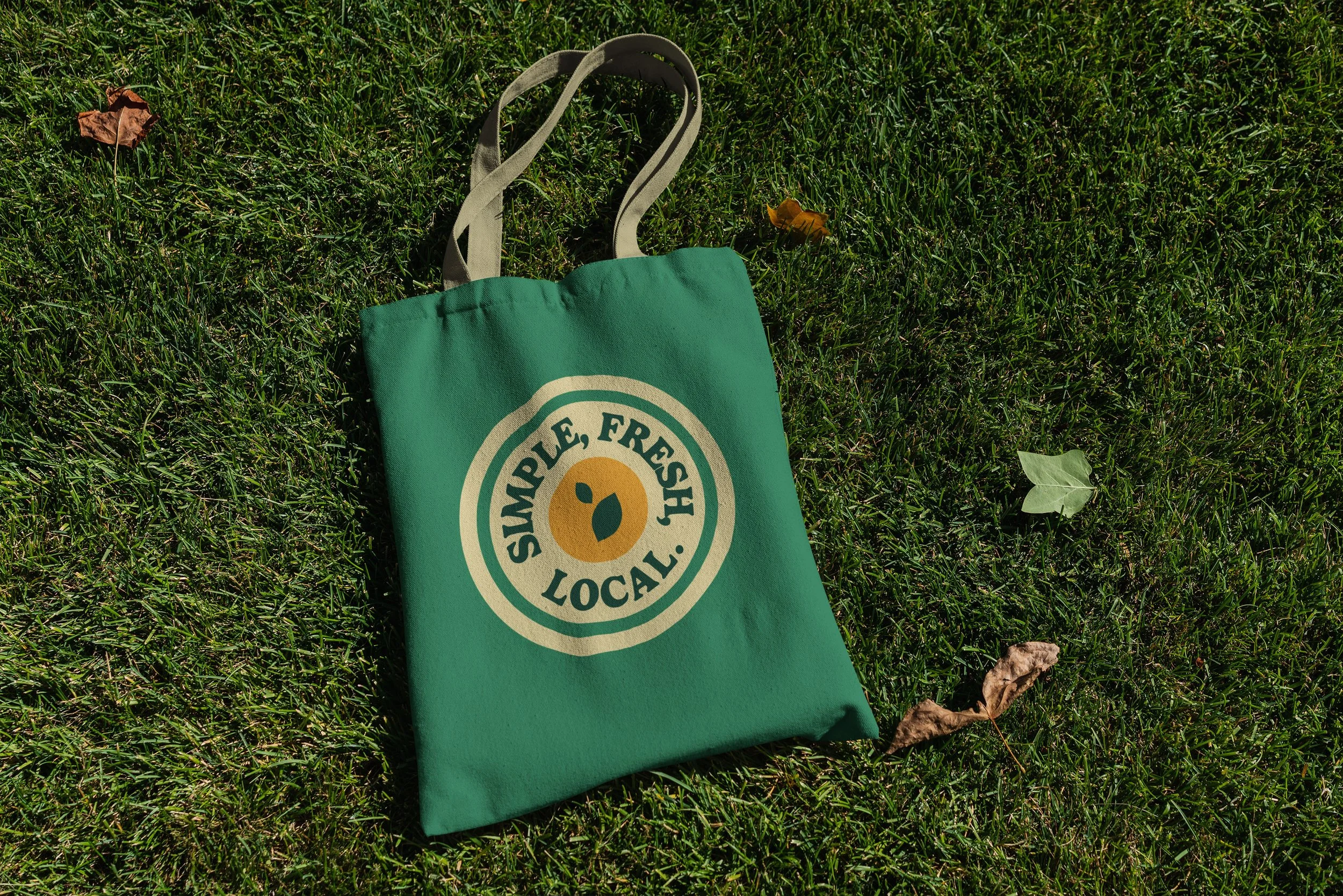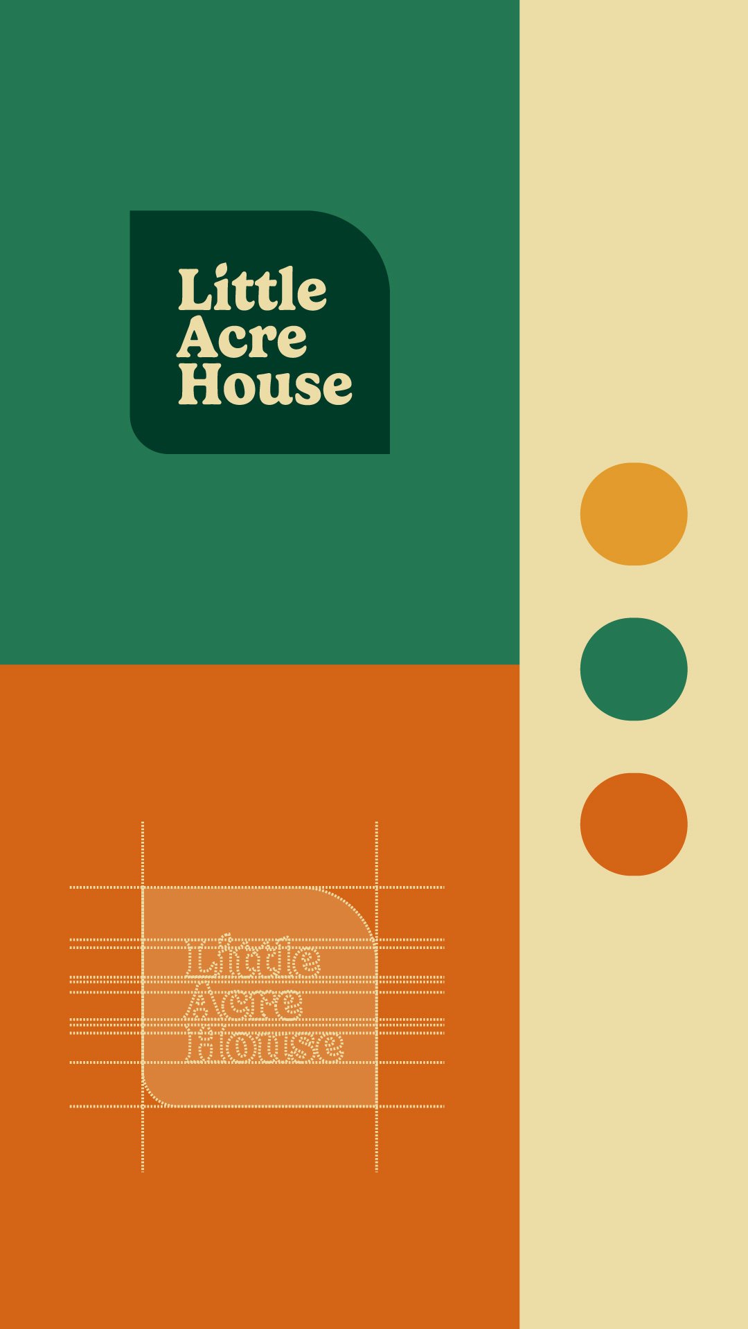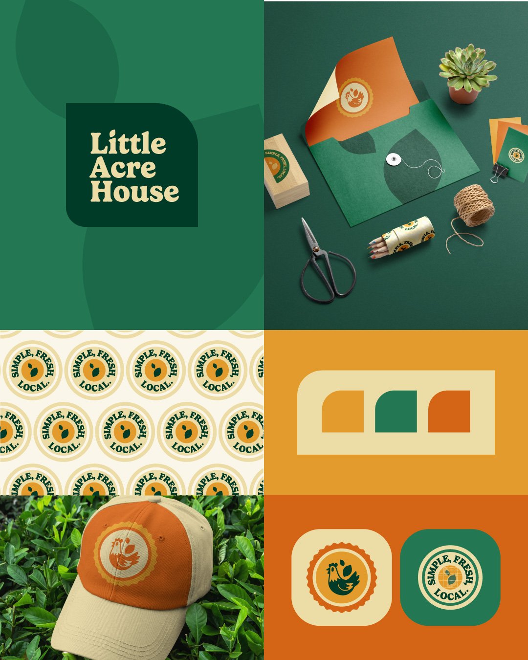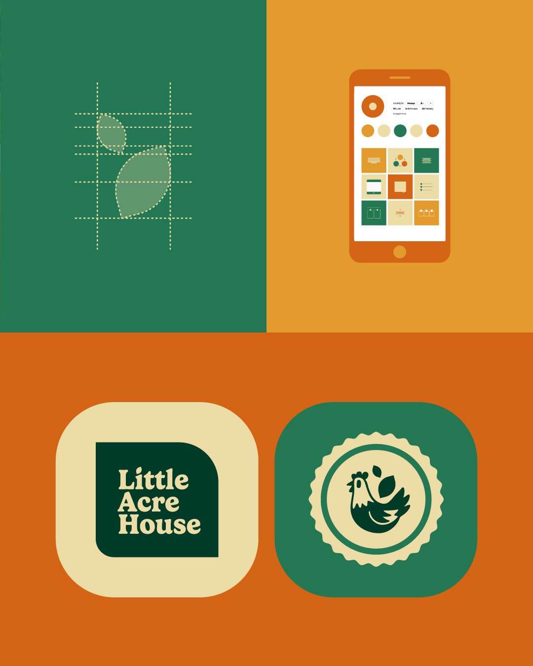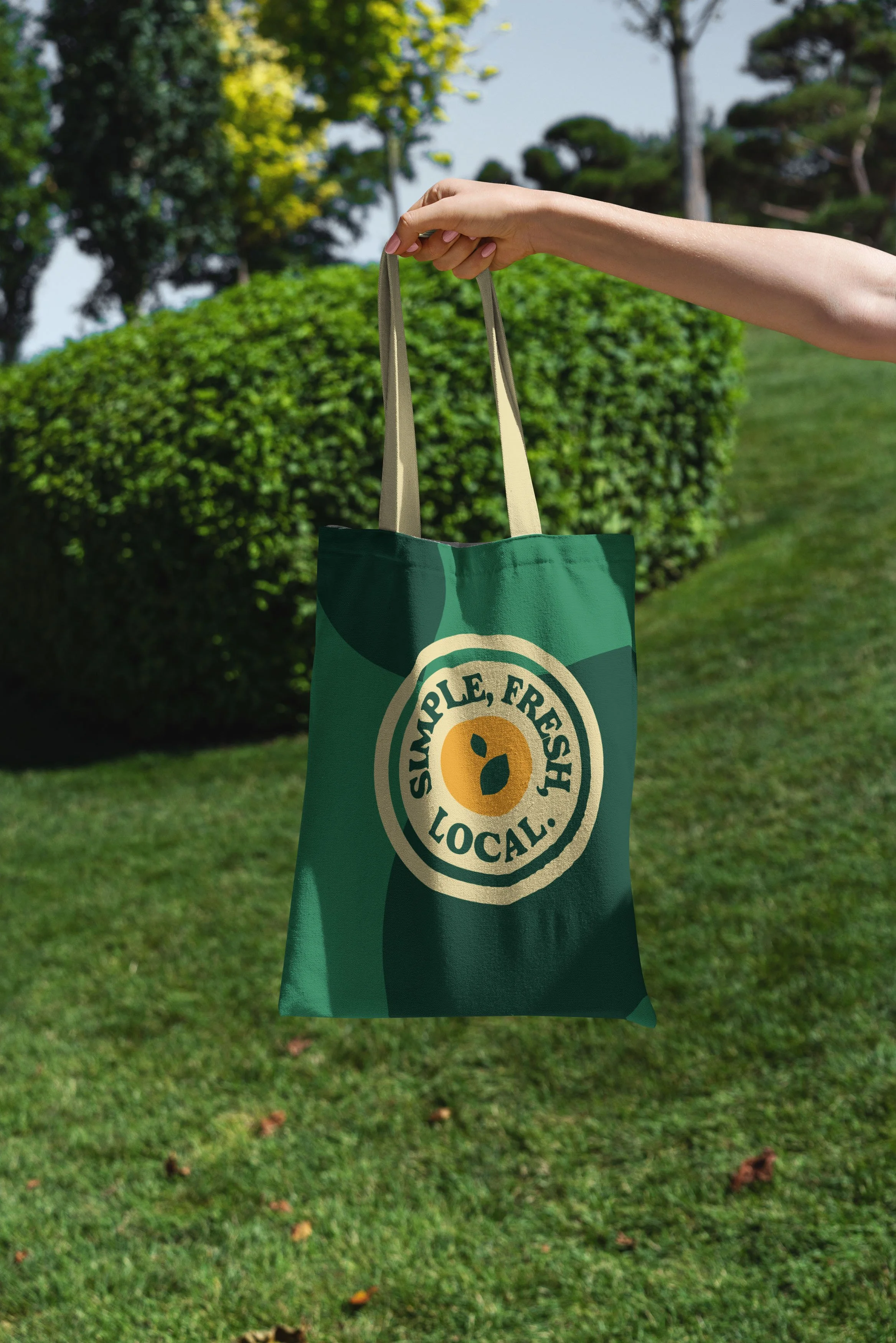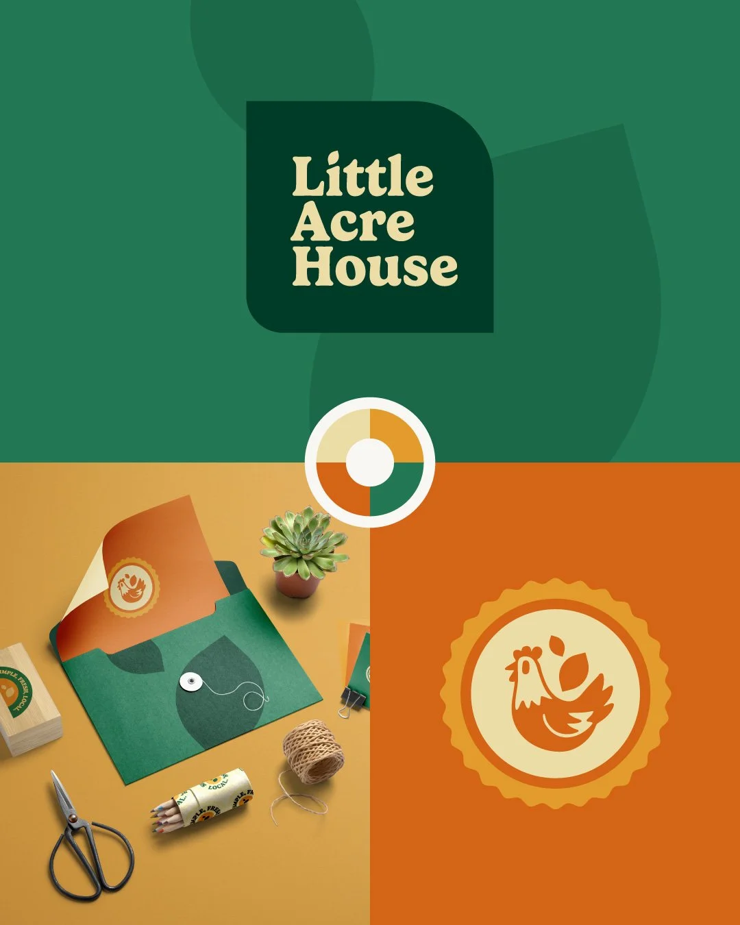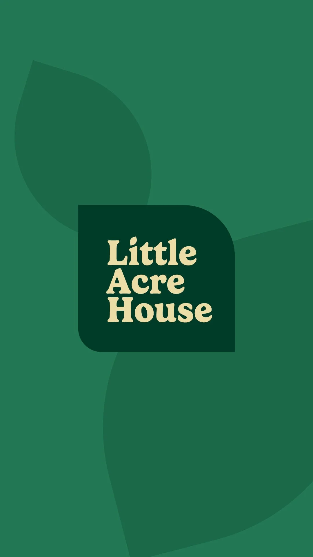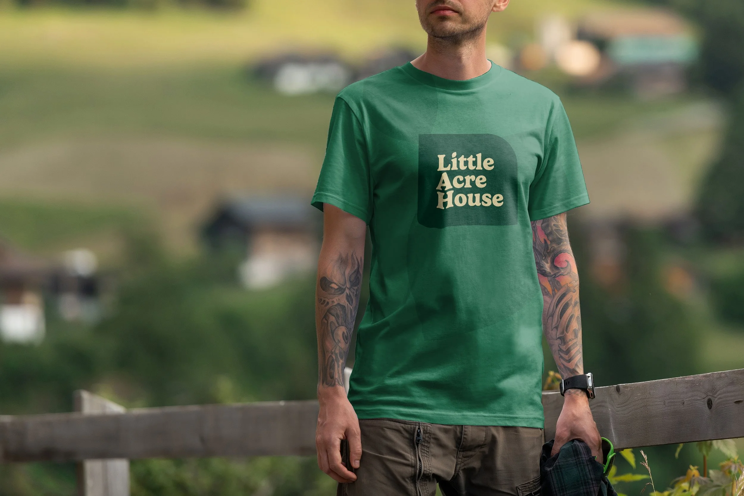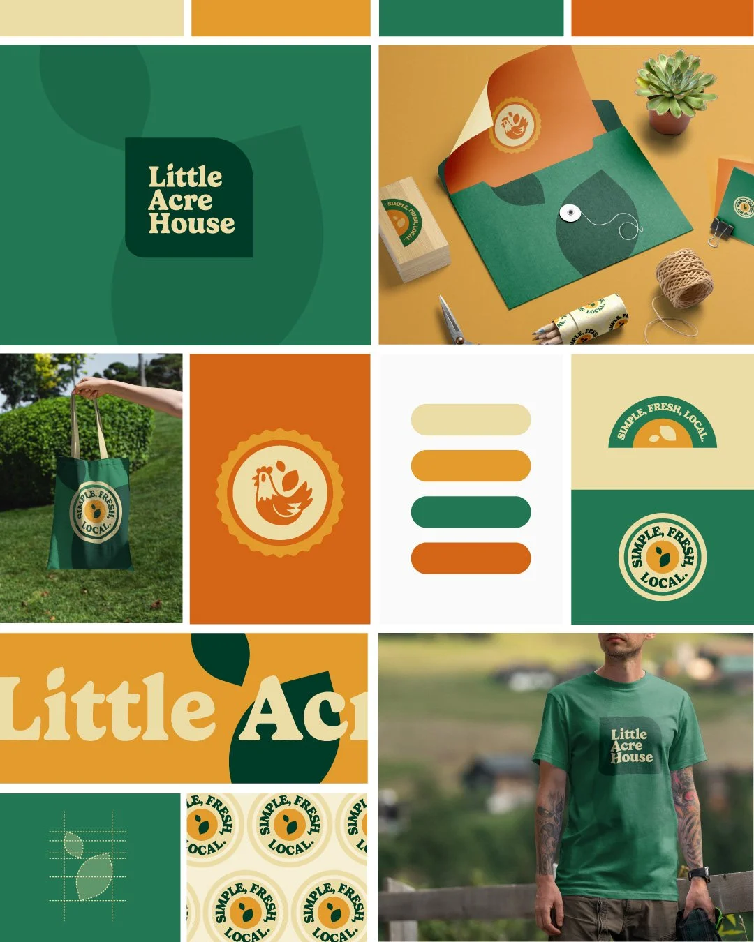
For Little Acre House, our identity centers on an organic, community-focused aesthetic that feels both nostalgic and refreshingly modern. The visual system is built around a vibrant, harvest-inspired palette of forest green, sun-drenched ochre, and warm terracotta, paired with soft cream neutrals. At its heart is a charming, mid-century illustrative style, featuring a friendly hen motif and leafy shapes that emphasize a "Simple, Fresh, Local" philosophy. The typography utilizes a sturdy, rounded serif that provides a sense of approachability and homegrown reliability. By blending these playful, hand-crafted elements with clean, geometric layouts, the brand positions itself as an authentic, artisanal producer rooted in local agriculture and sustainable living.