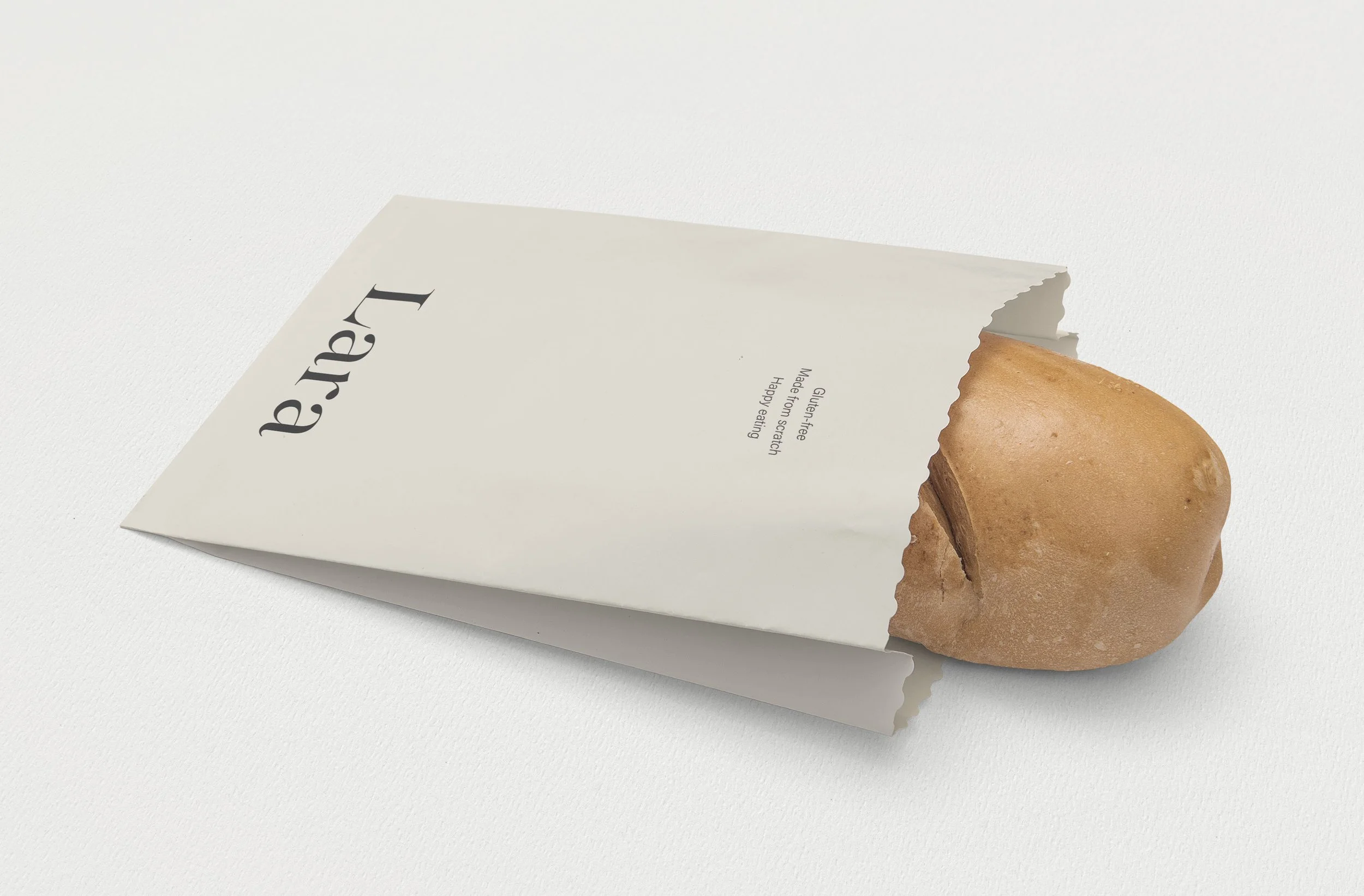
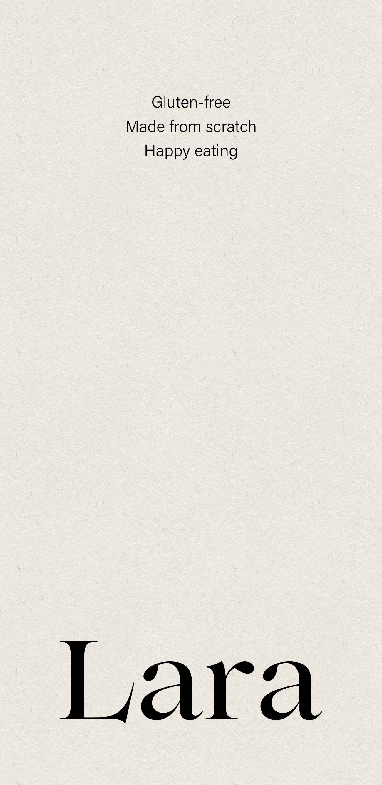
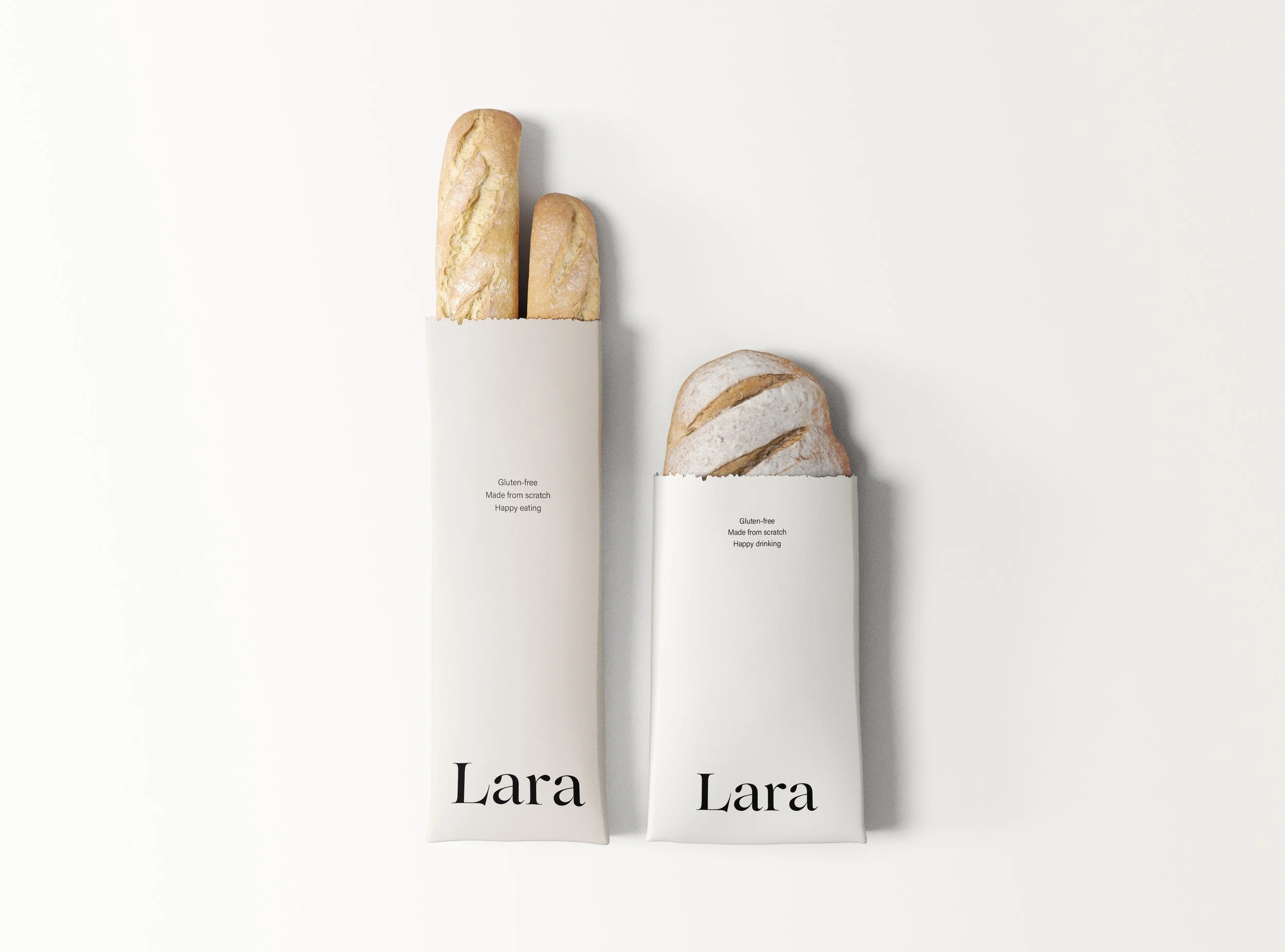
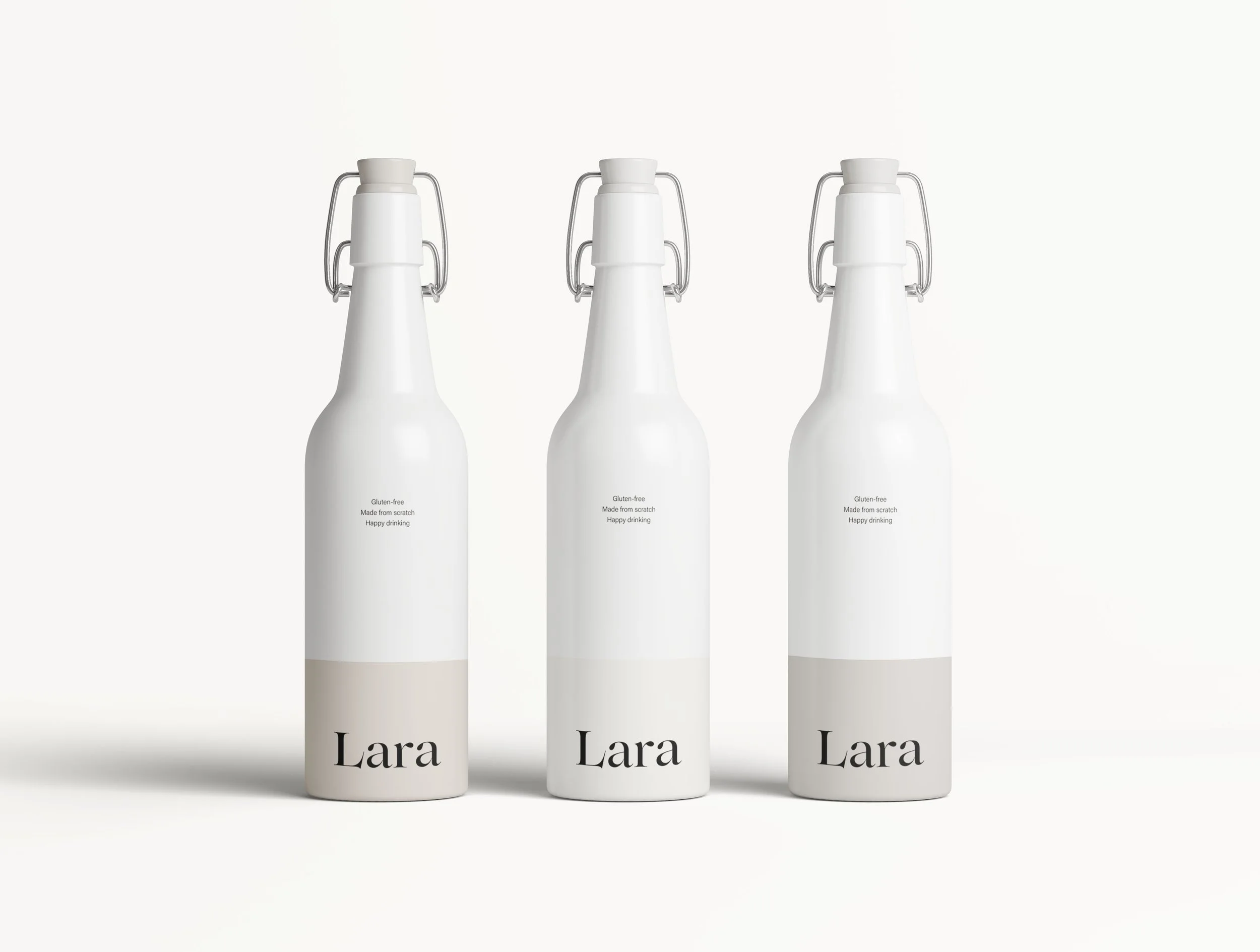
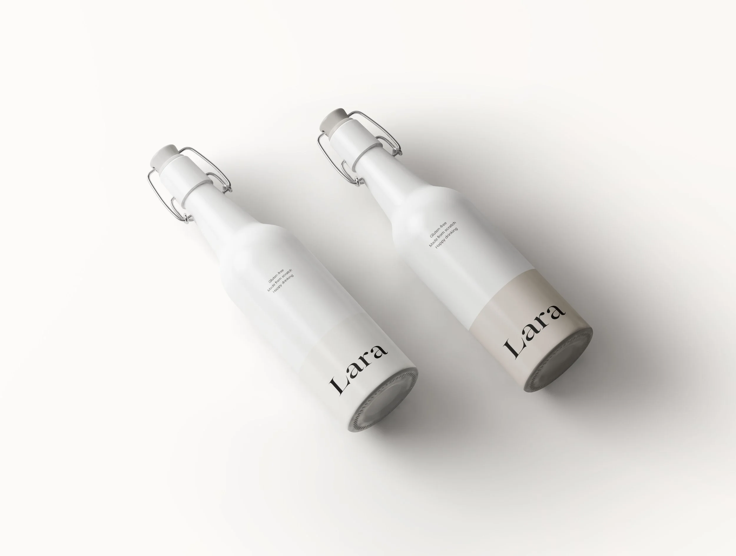
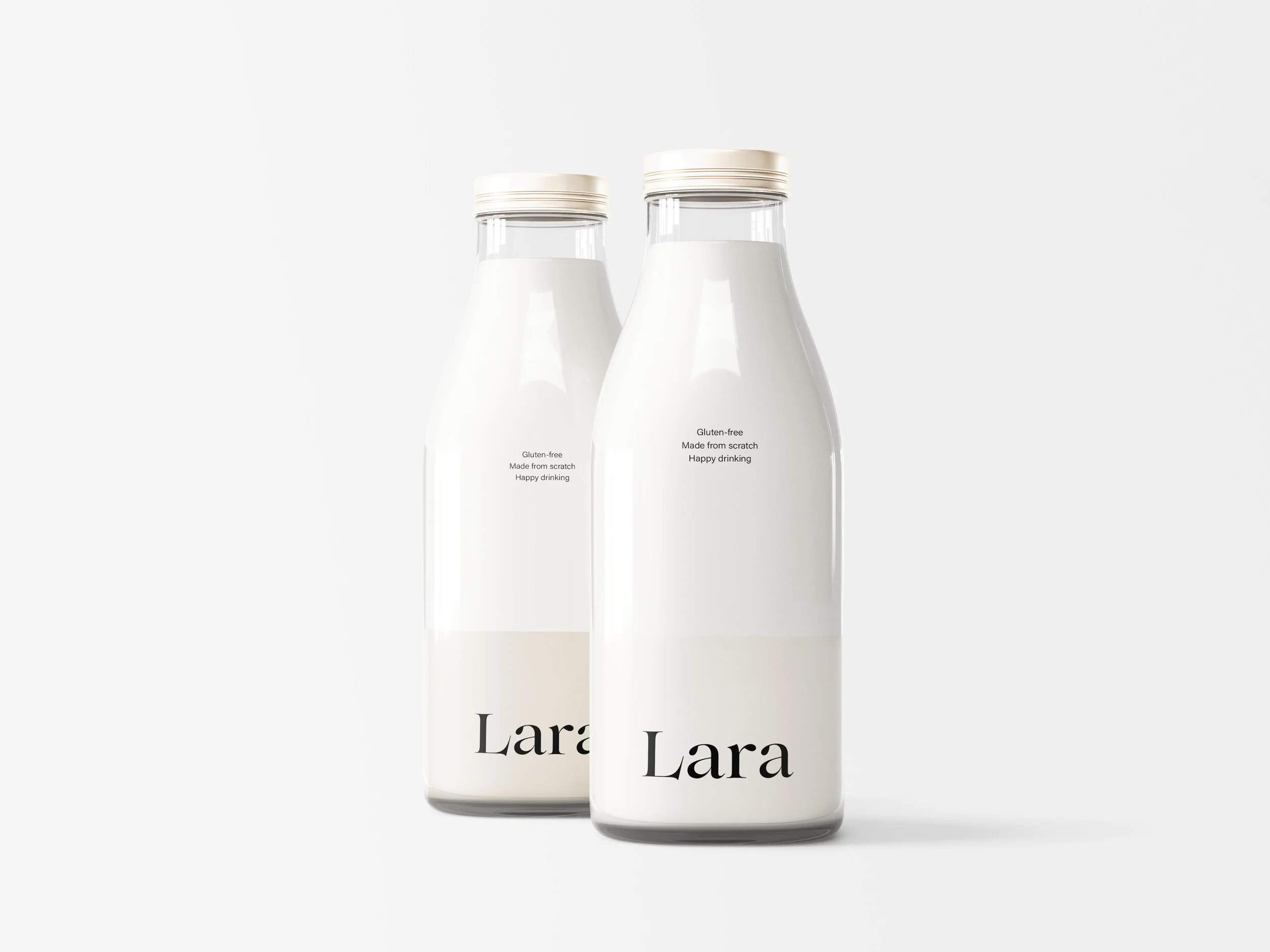
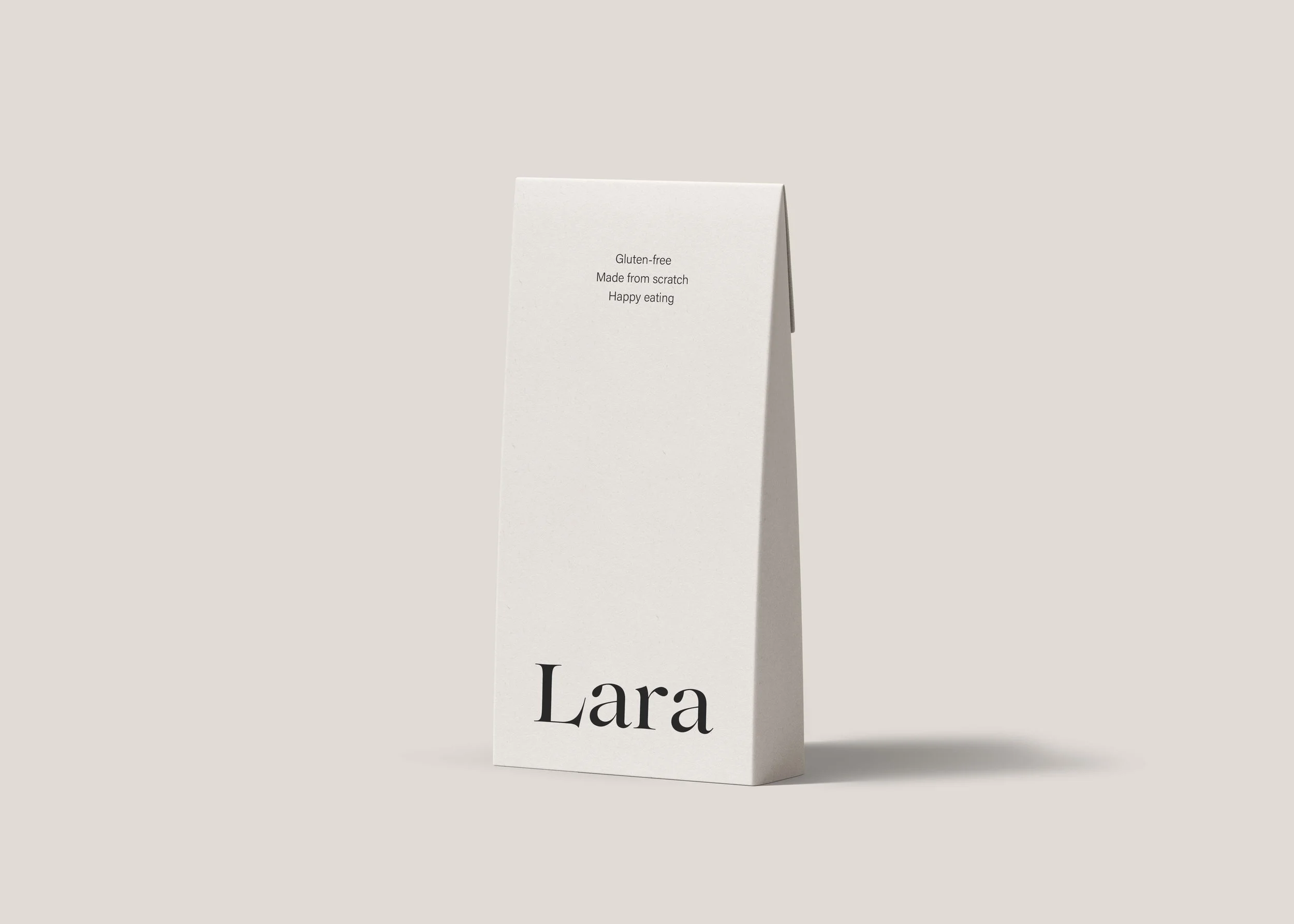
The visual identity for Lara centers on welcoming minimalism, stripping away excess to focus on the purity of the product. We utilized a restrained but friendly palette of bone white, warm limestone, and soft putty, creating a clinical yet inviting aesthetic that feels "honestly made." The typography is anchored by a bold, high-contrast serif with unique character spacing, providing a sophisticated editorial feel against vast amounts of negative space. By applying this "quiet luxury" approach to everyday staples like bread and milk, the design elevates the mundane through simplicity and a focus on form, positioning Lara as a premium artisanal brand that feels approachable.