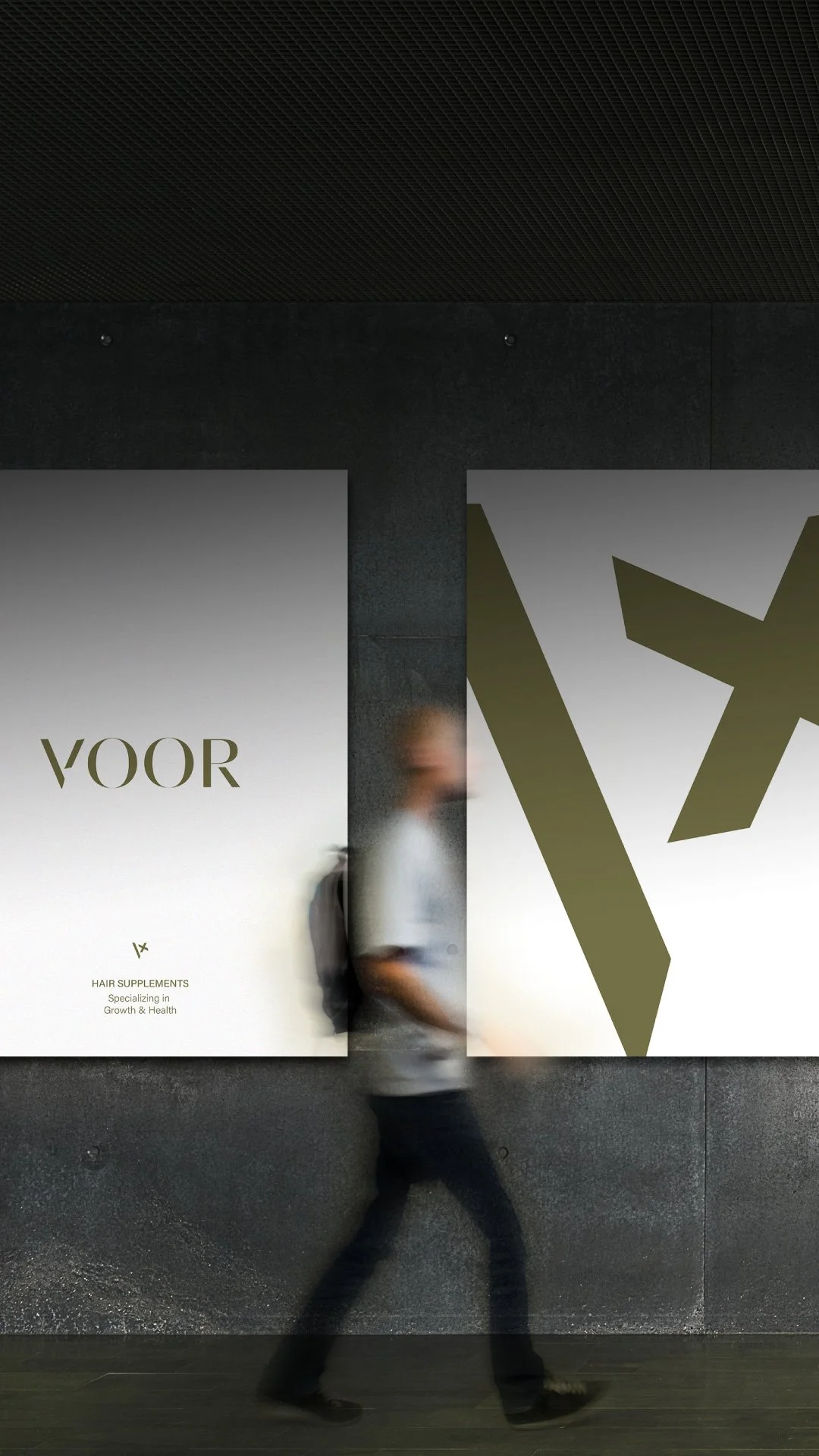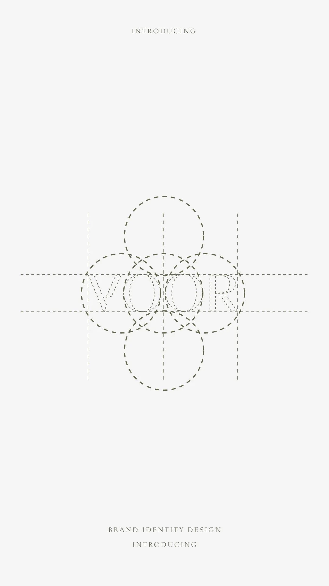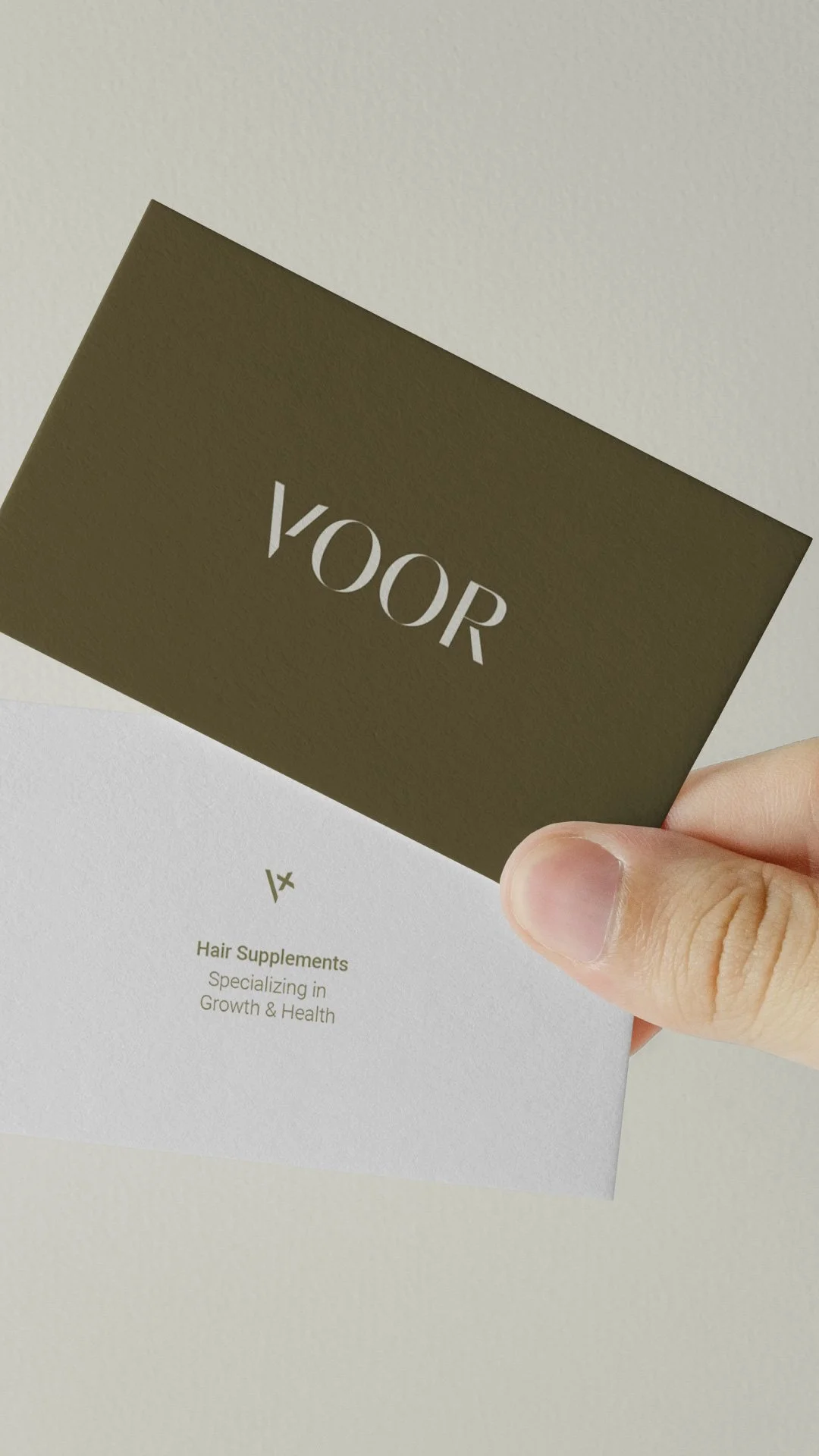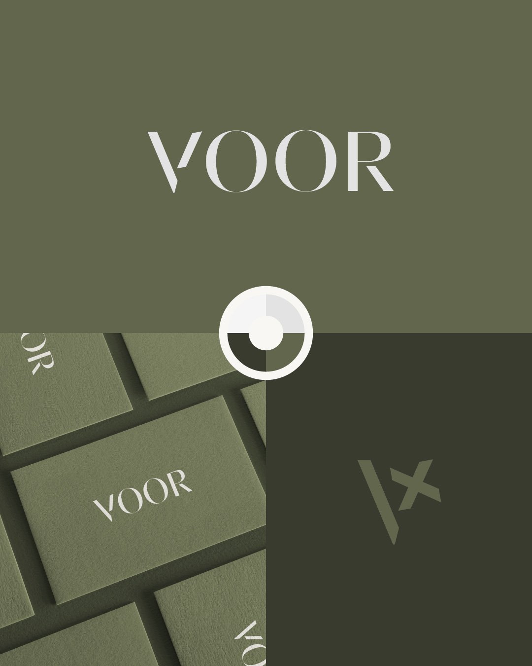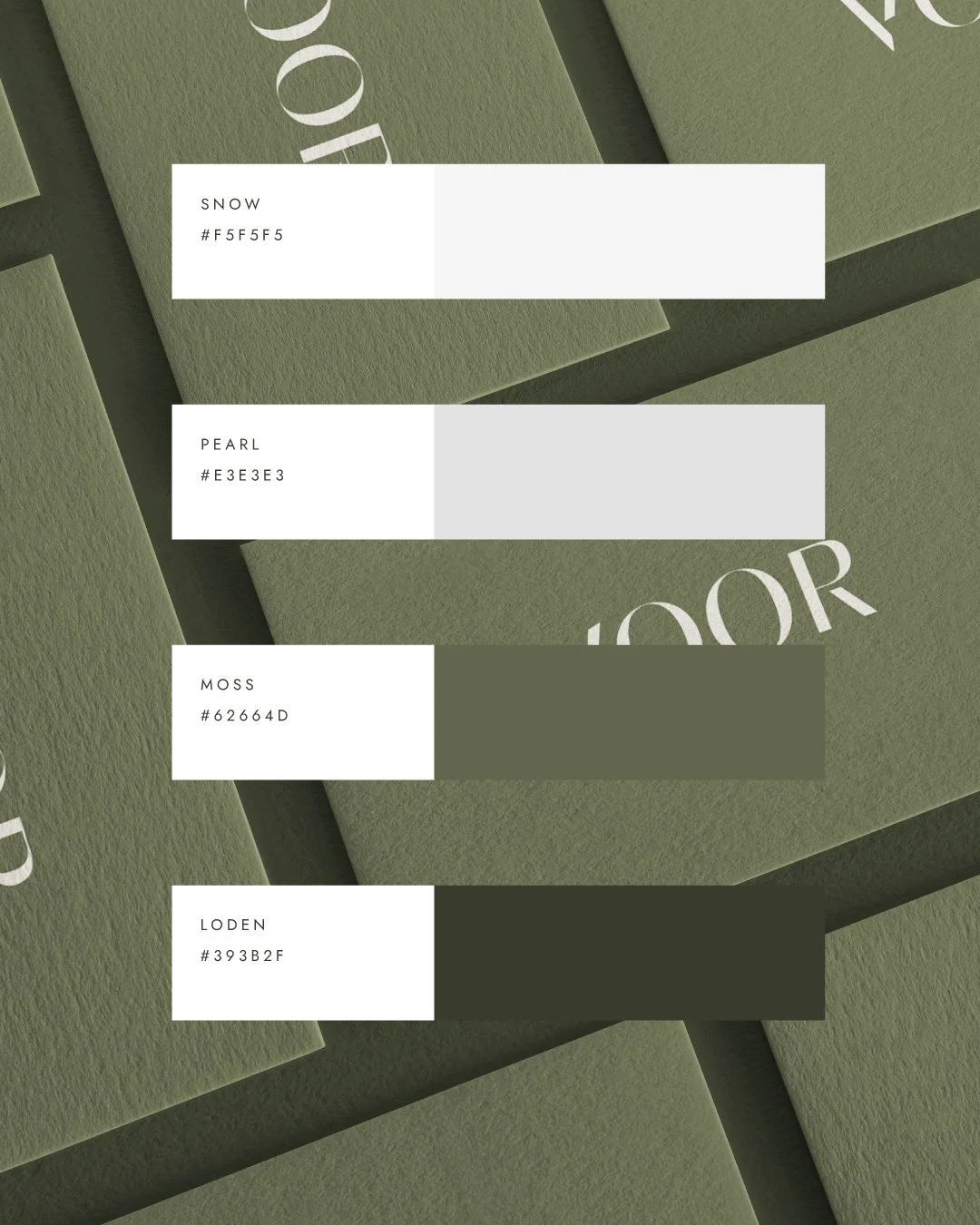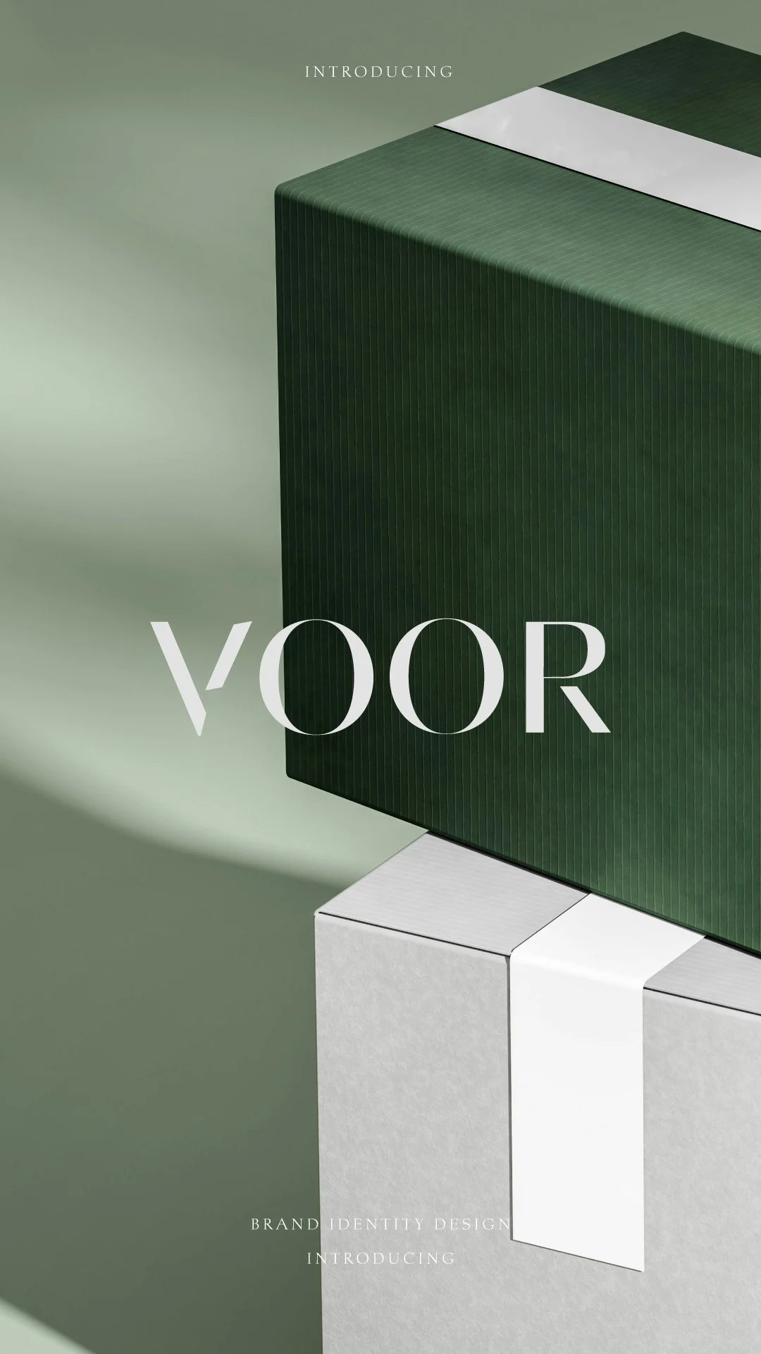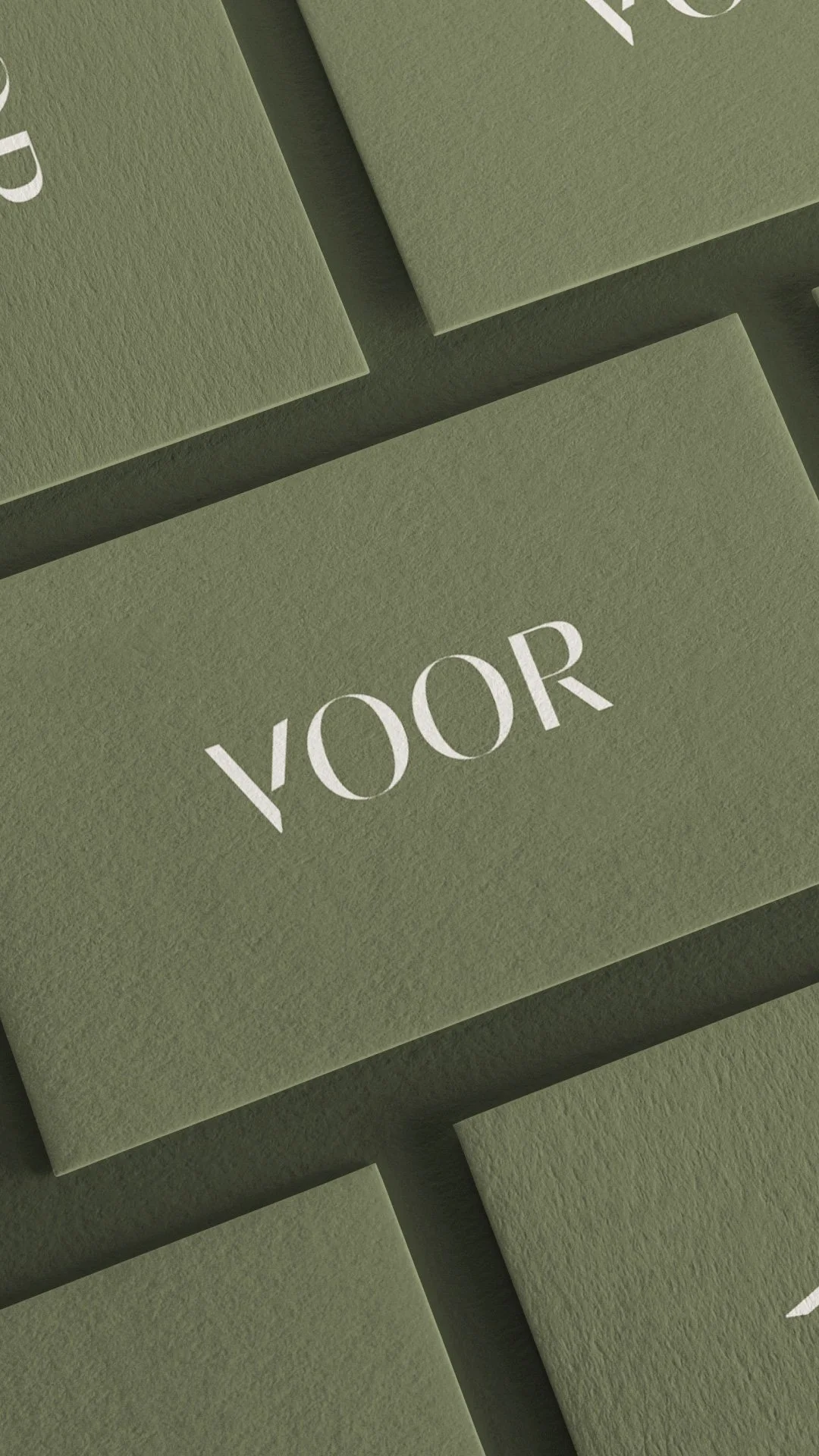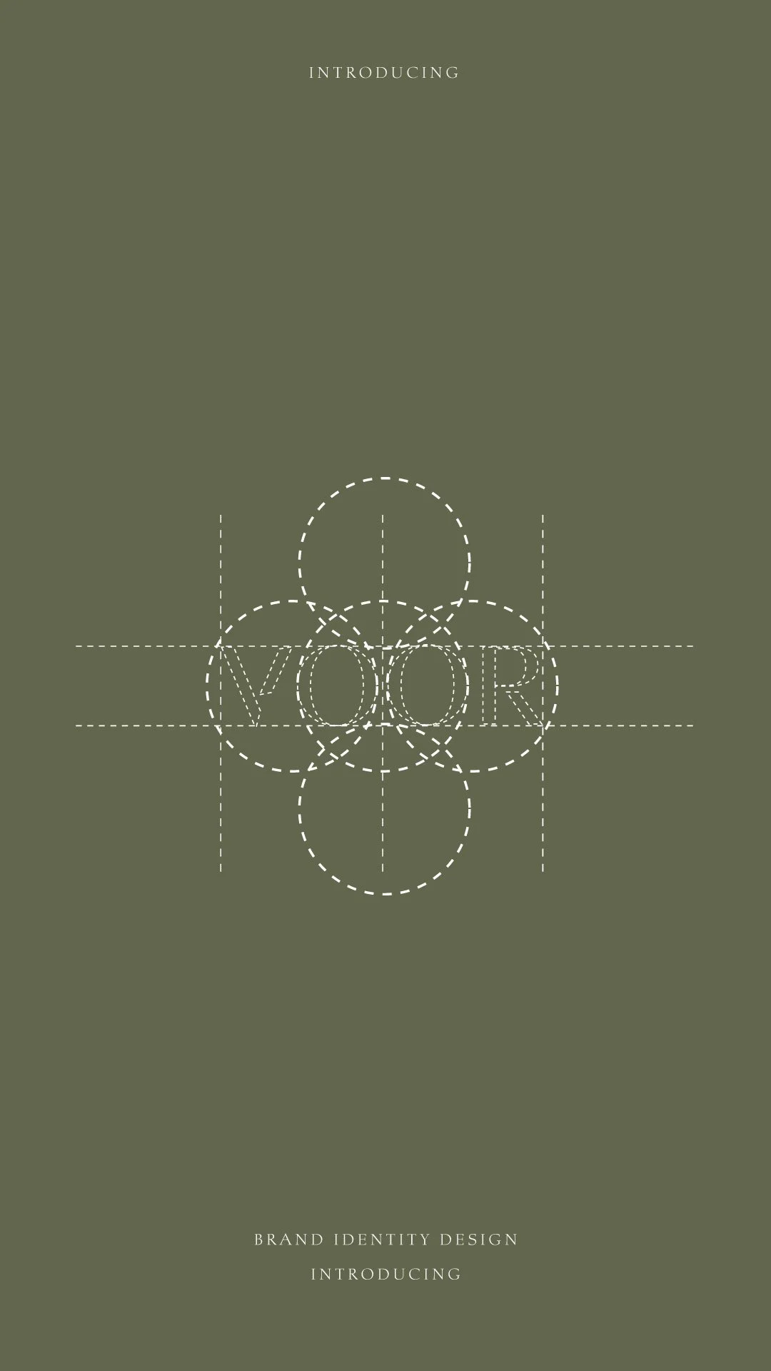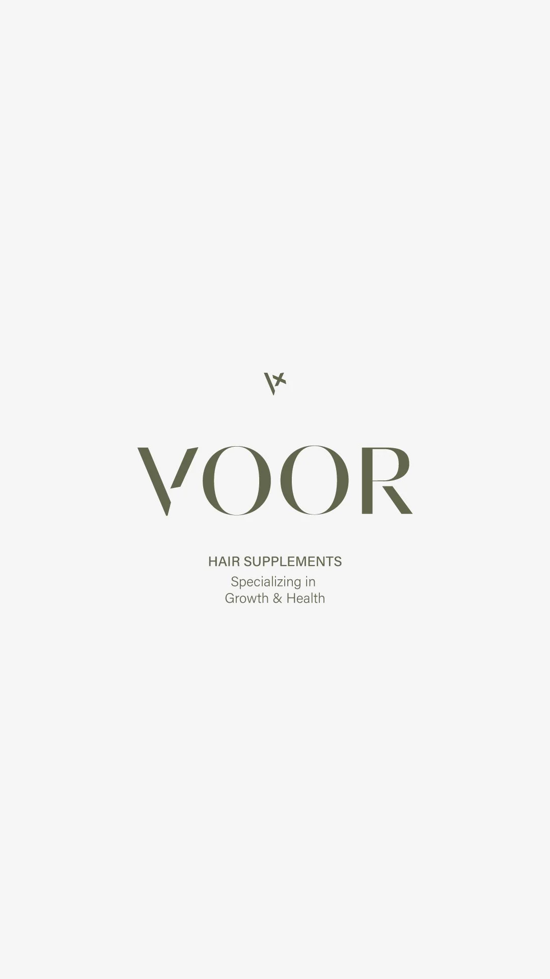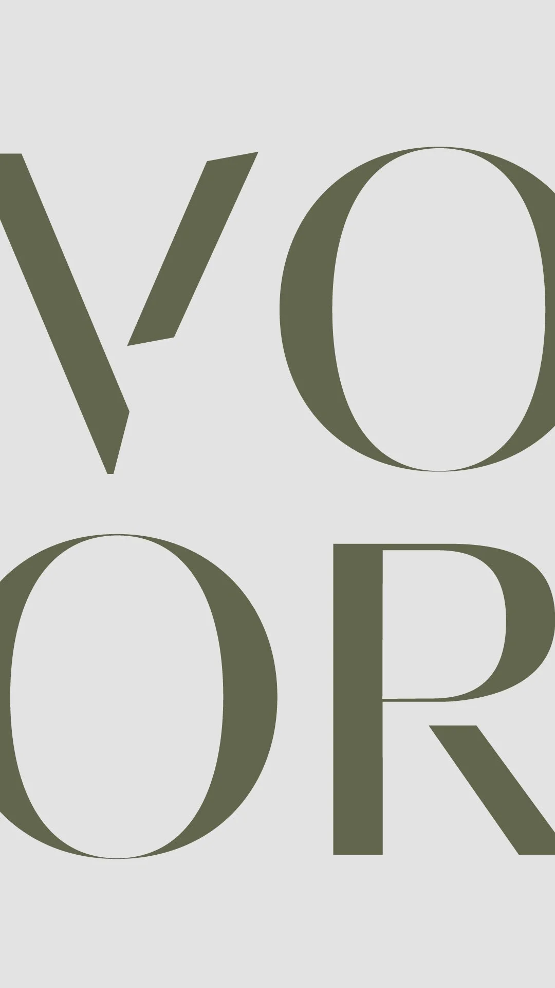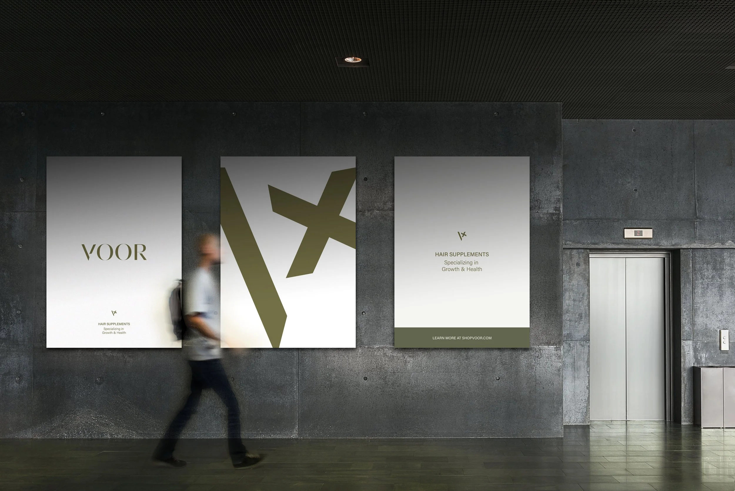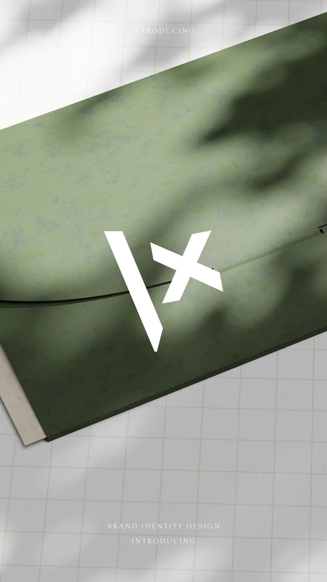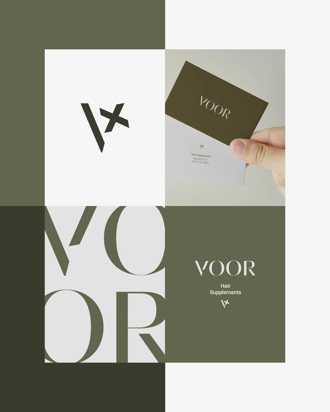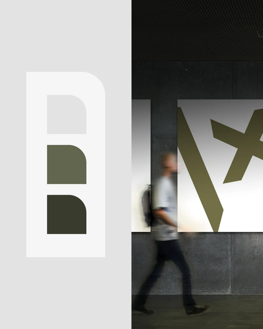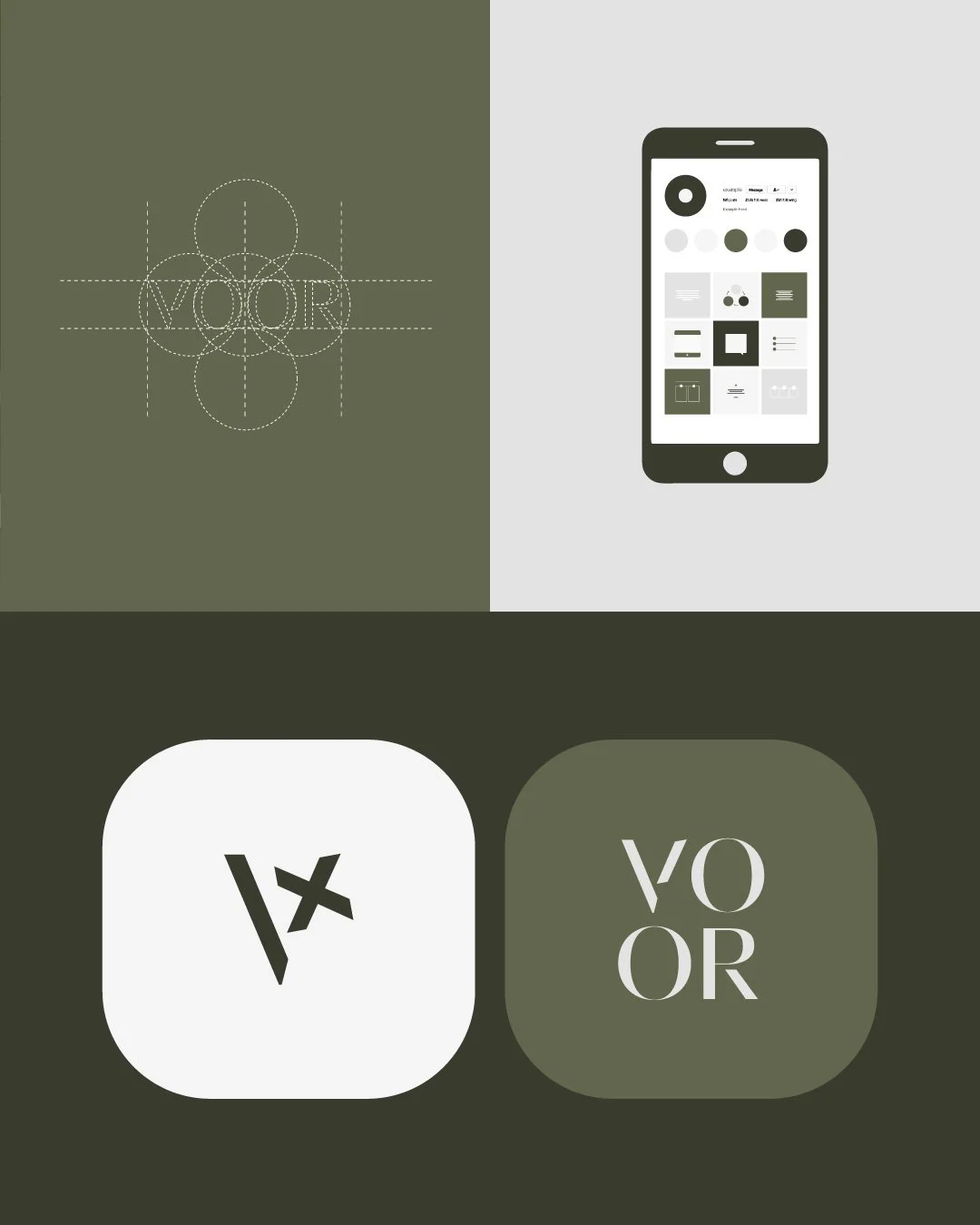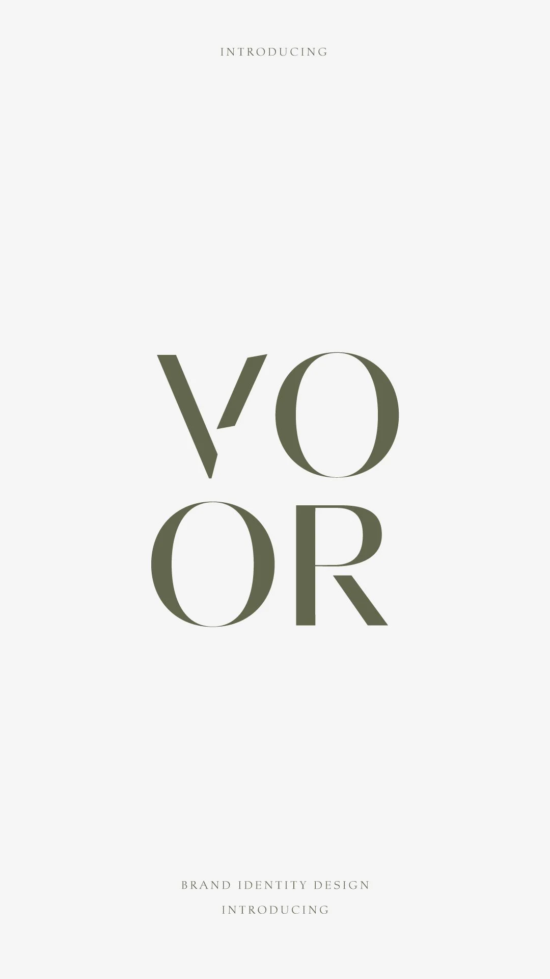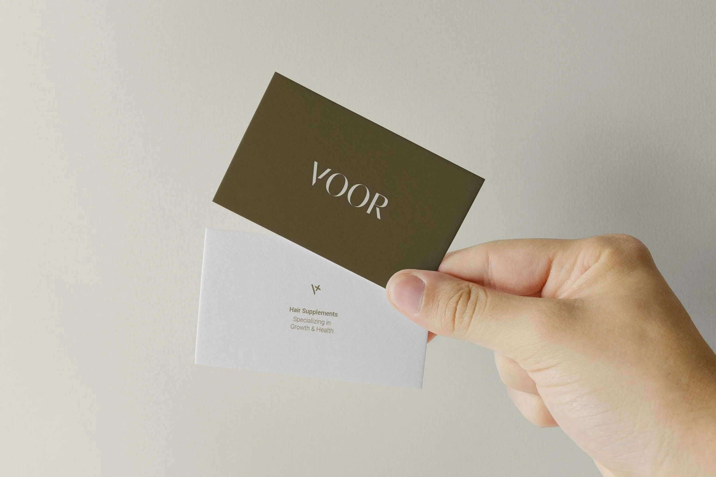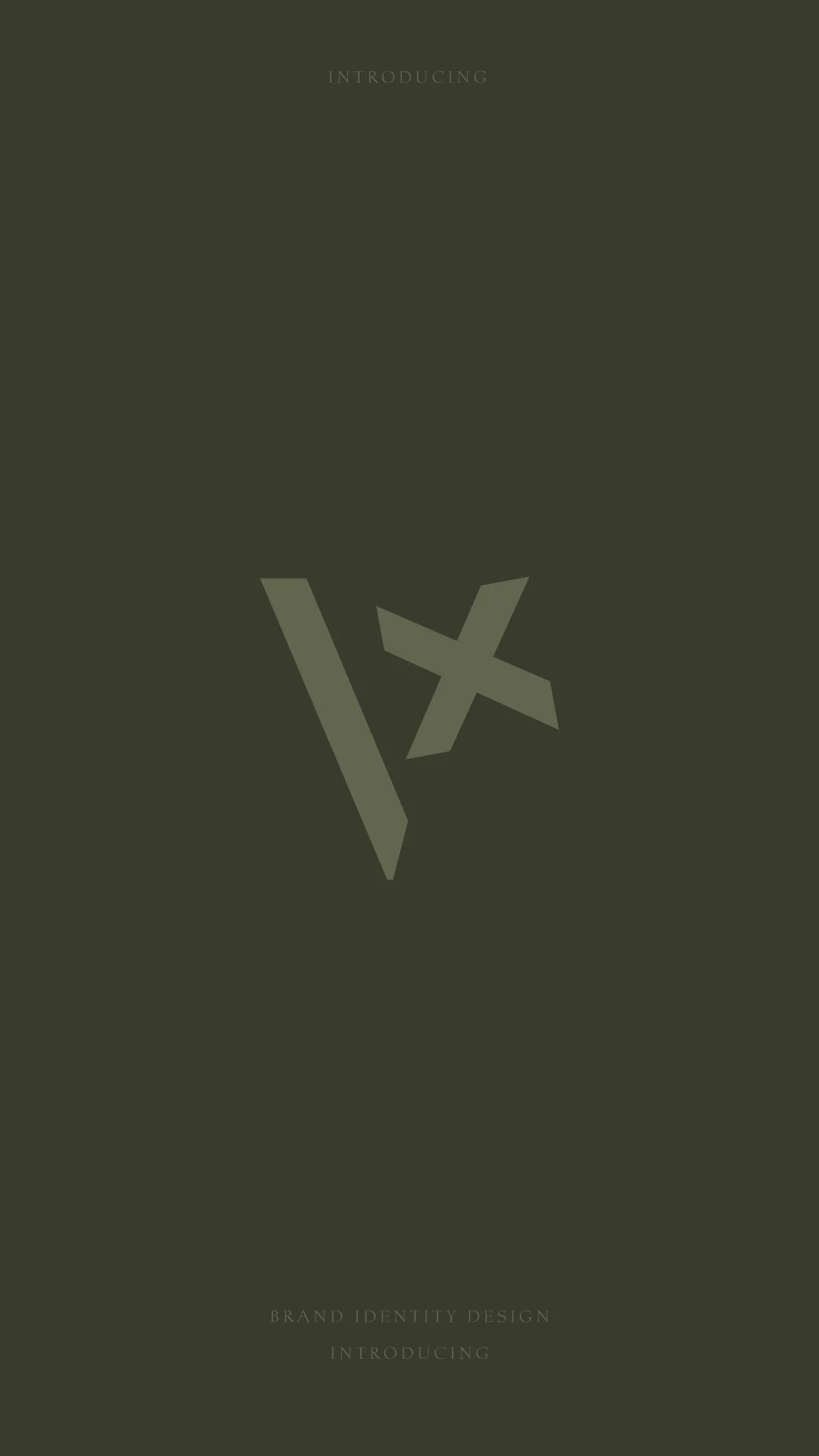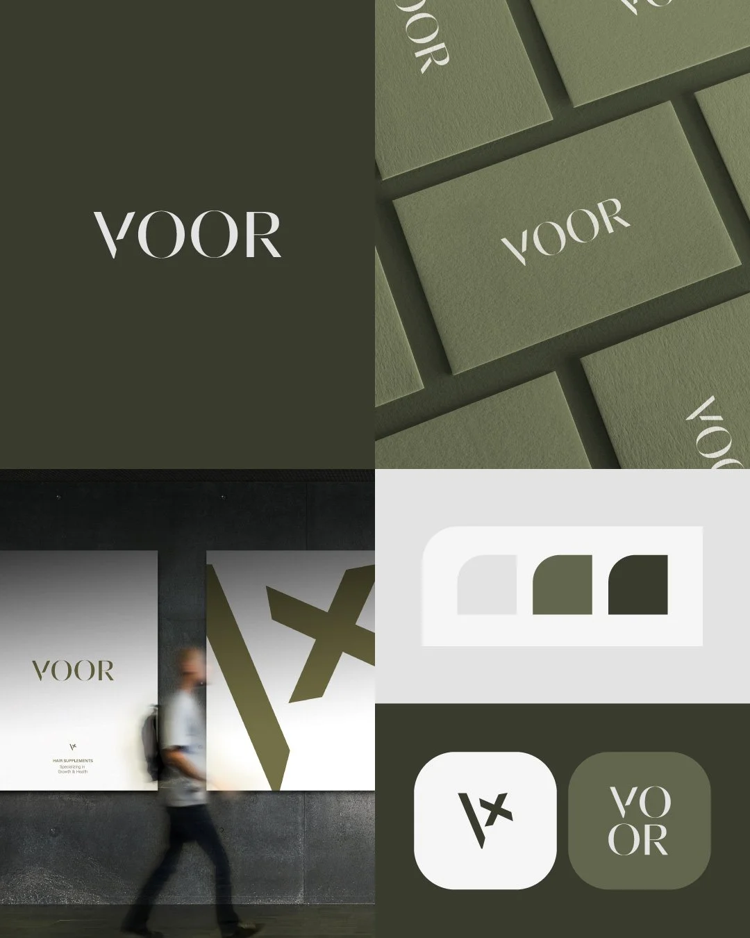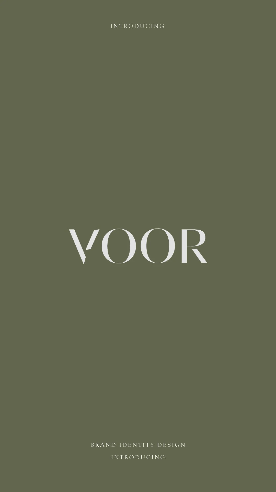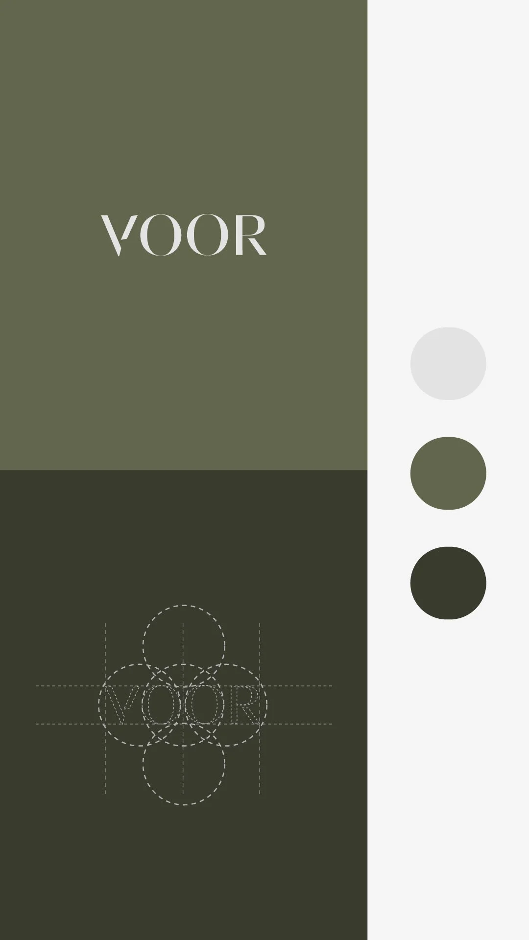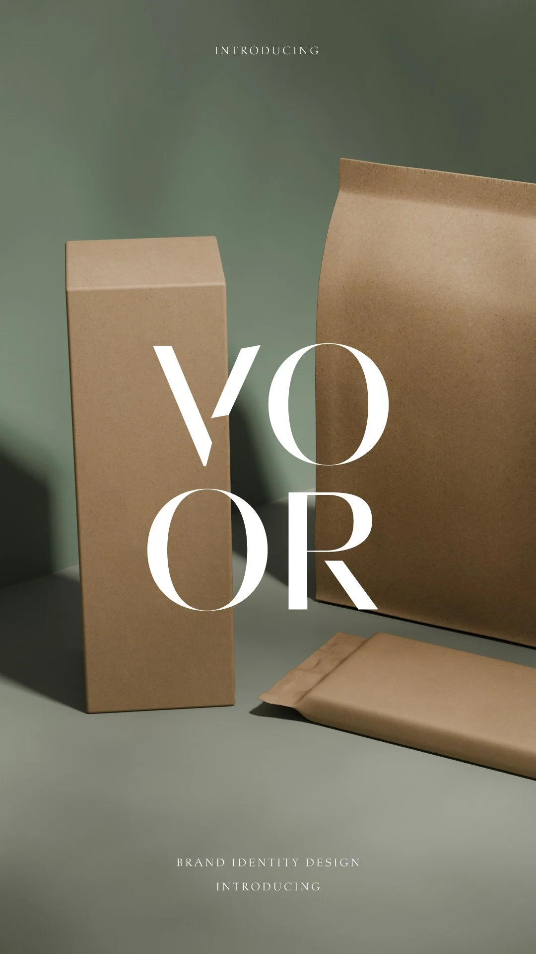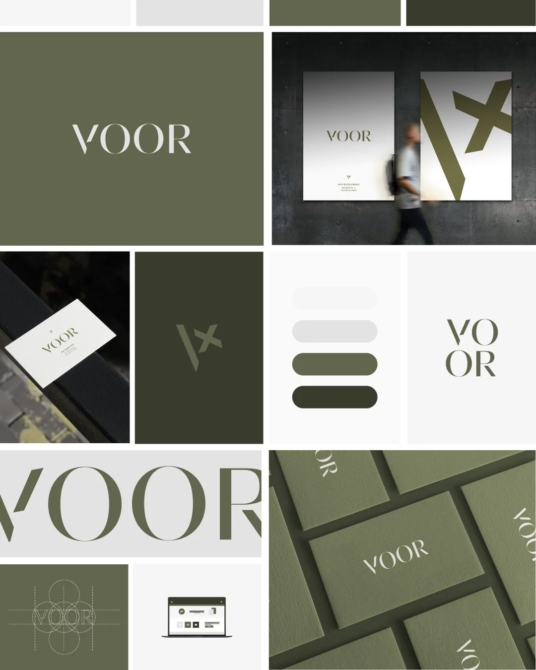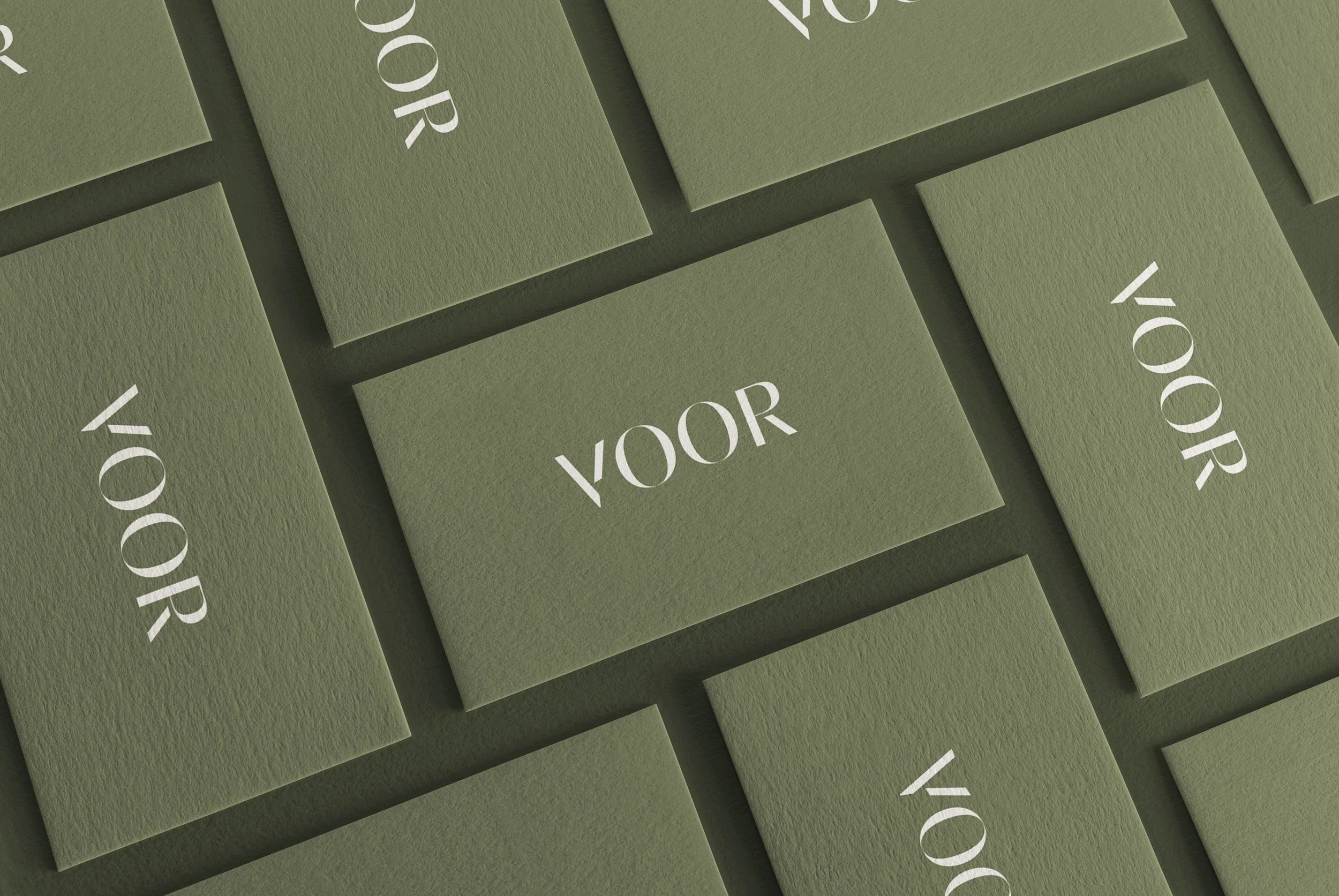
The visual identity for Voor centers on a restrained, utilitarian elegance that elevates hair supplements through a minimalist lens. The brand is grounded in a muted, organic palette of Moss green, Loden charcoal, and Pearl gray, evoking a sense of stable, natural strength. Its typographic system is anchored by a stark, high-contrast serif with unique, geometric letterforms—most notably the diagonal cross-bar of the "V"—which suggests both precision and a modern edge. By utilizing oversized, cropped typography against expansive negative space and tactile, textured paper stocks, the design positions Voor as a sophisticated, science-led authority in the wellness space.