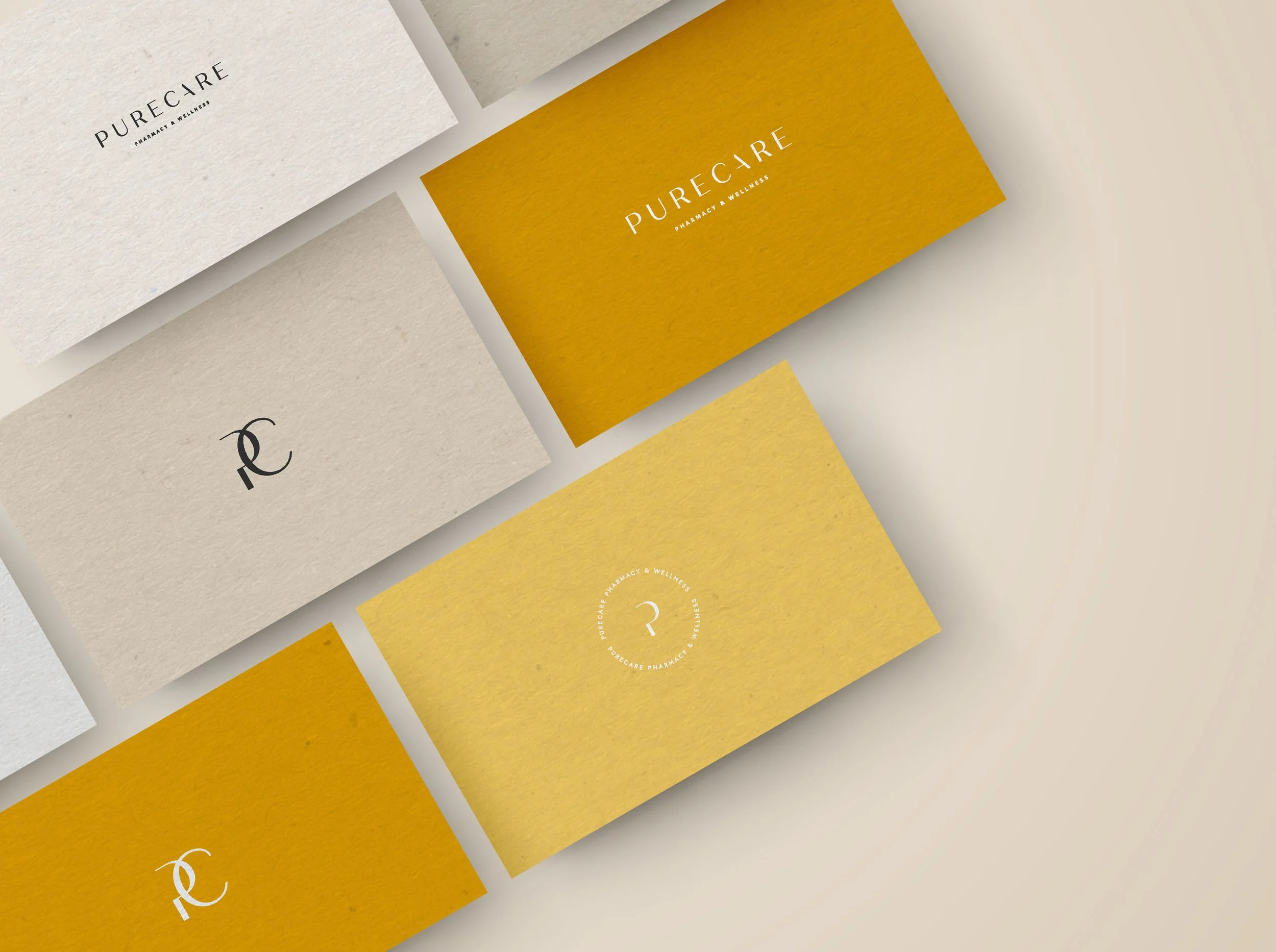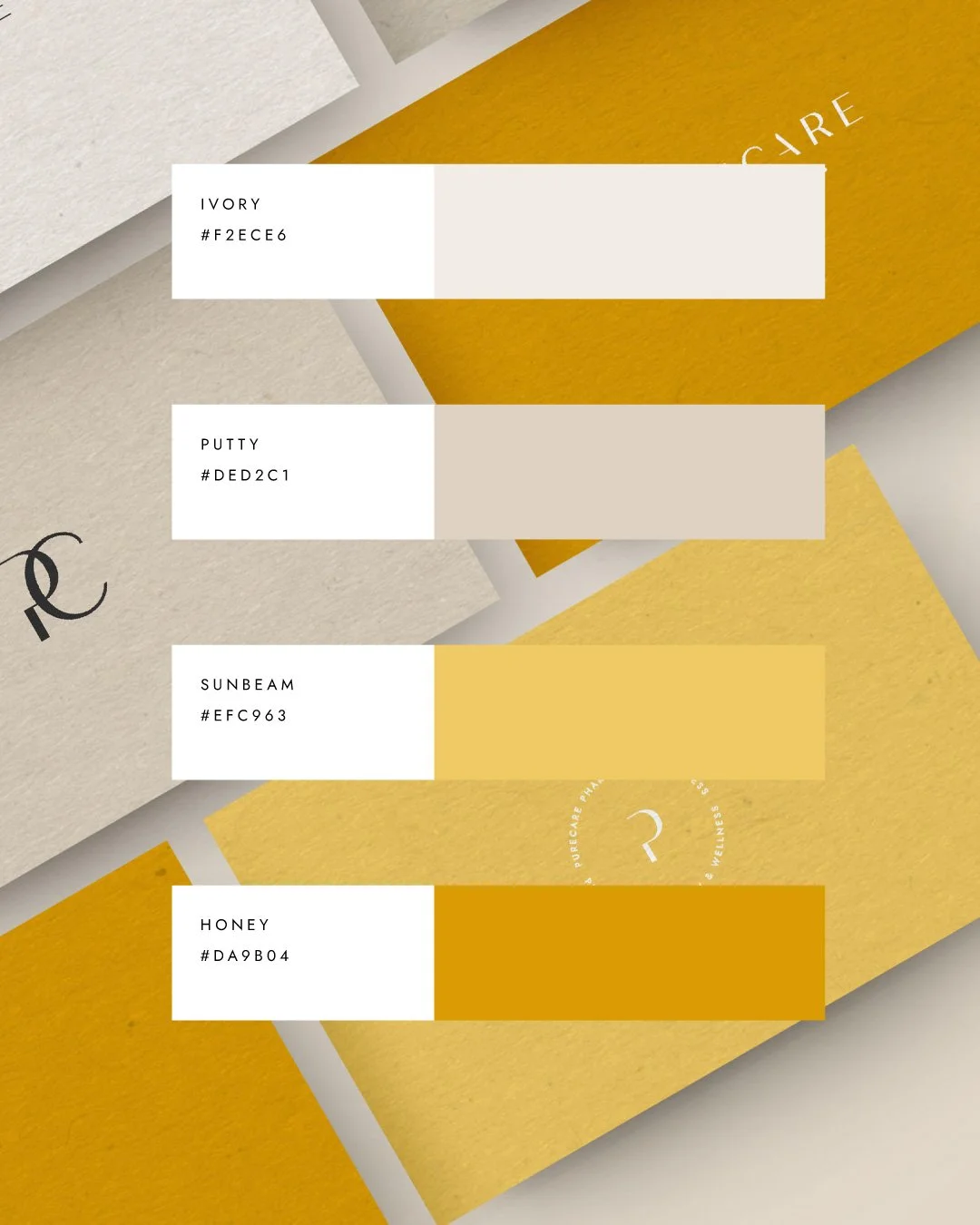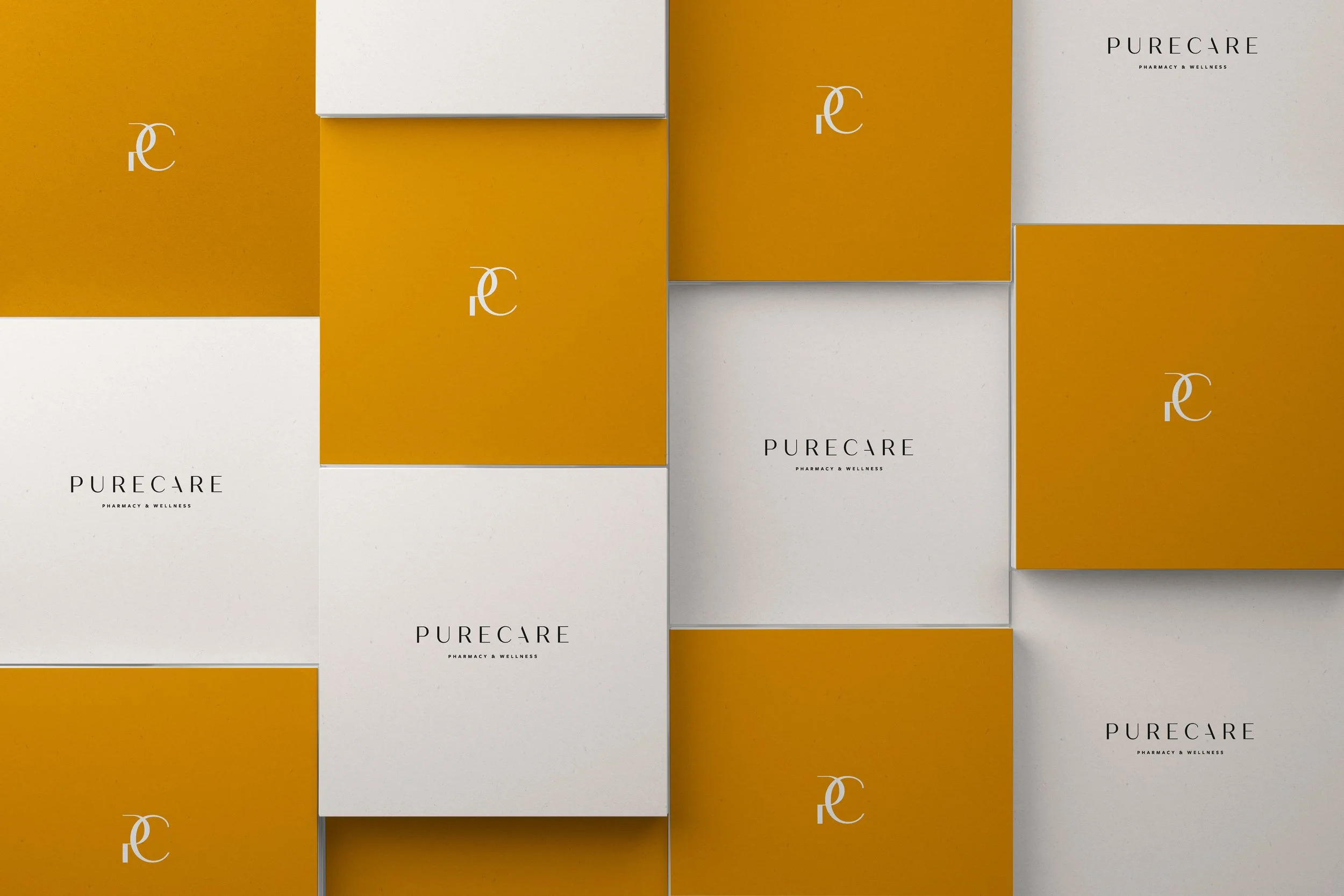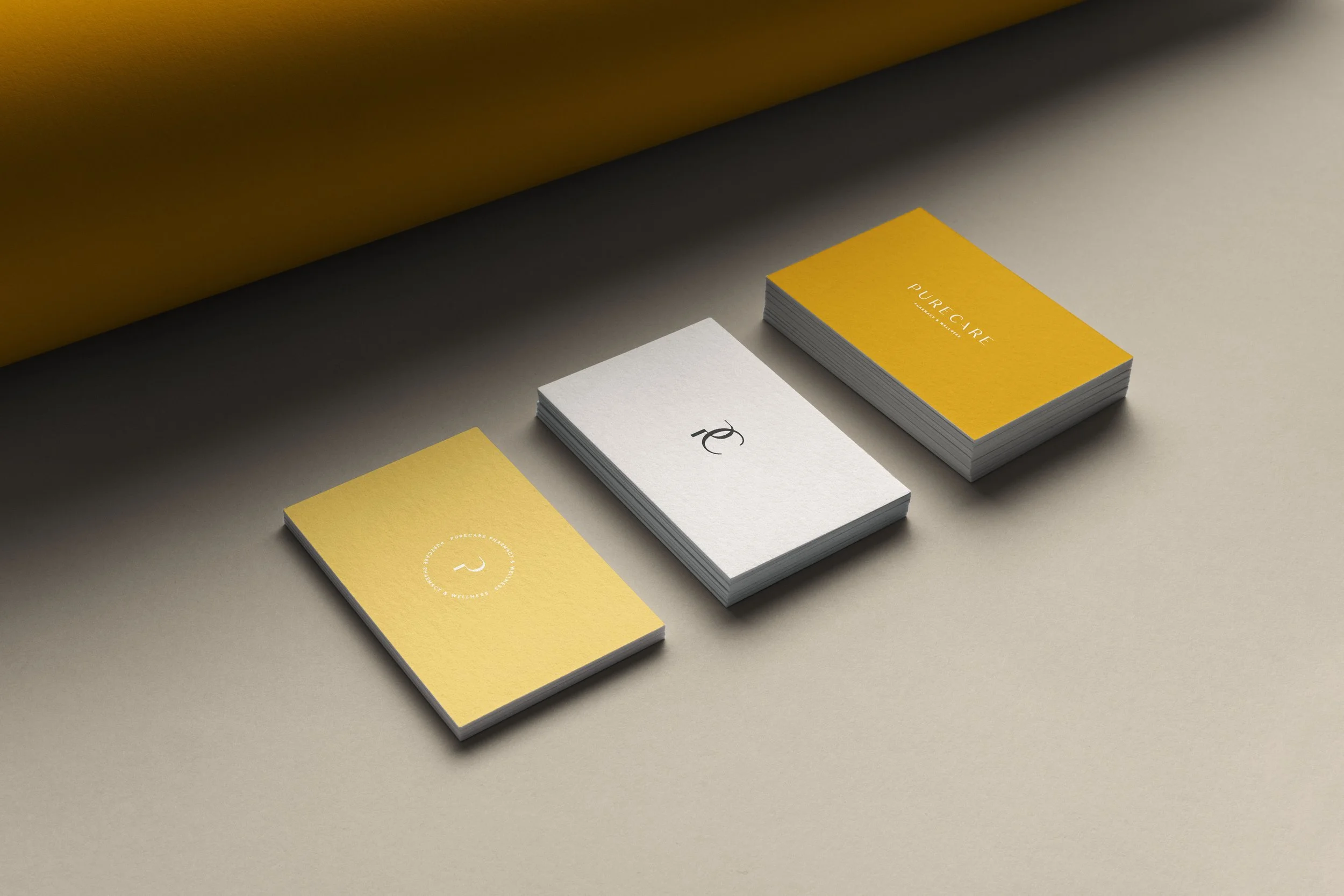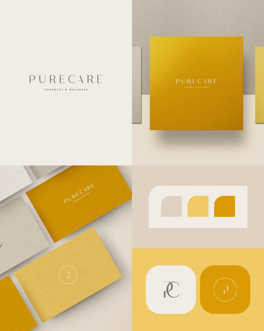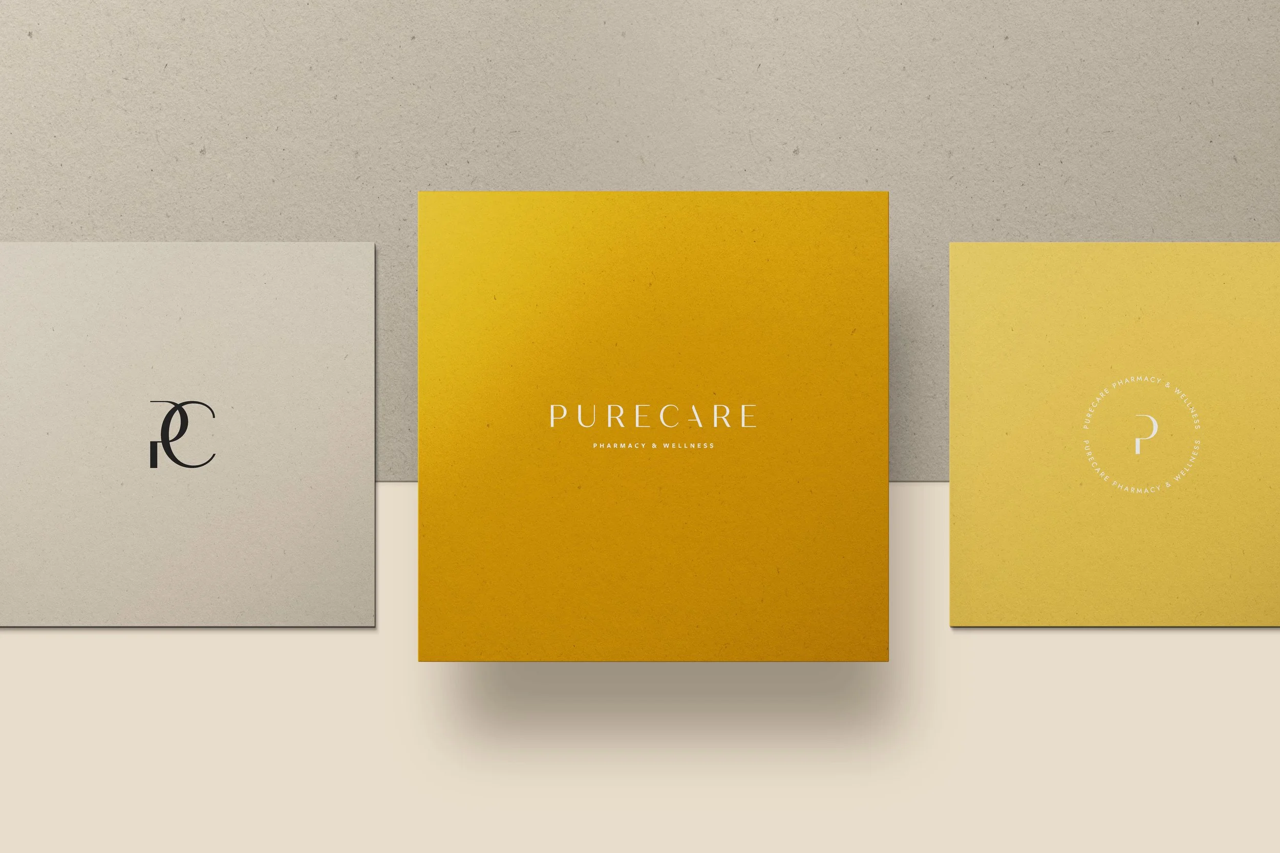
Purecare redefines the pharmacy experience through a warm, radiant visual language that swaps clinical coldness for a sophisticated, honey-toned glow. Built on a palette of sunbeam and honey-inspired tones, the identity utilizes a refined, wide-spaced sans-serif wordmark and a delicate "PC" monogram to communicate high-end reliability. The design balances tactile, textured paper stocks with clean circular geometry and expansive negative space, positioning the brand as a premium sanctuary focused on clarity and holistic comfort.