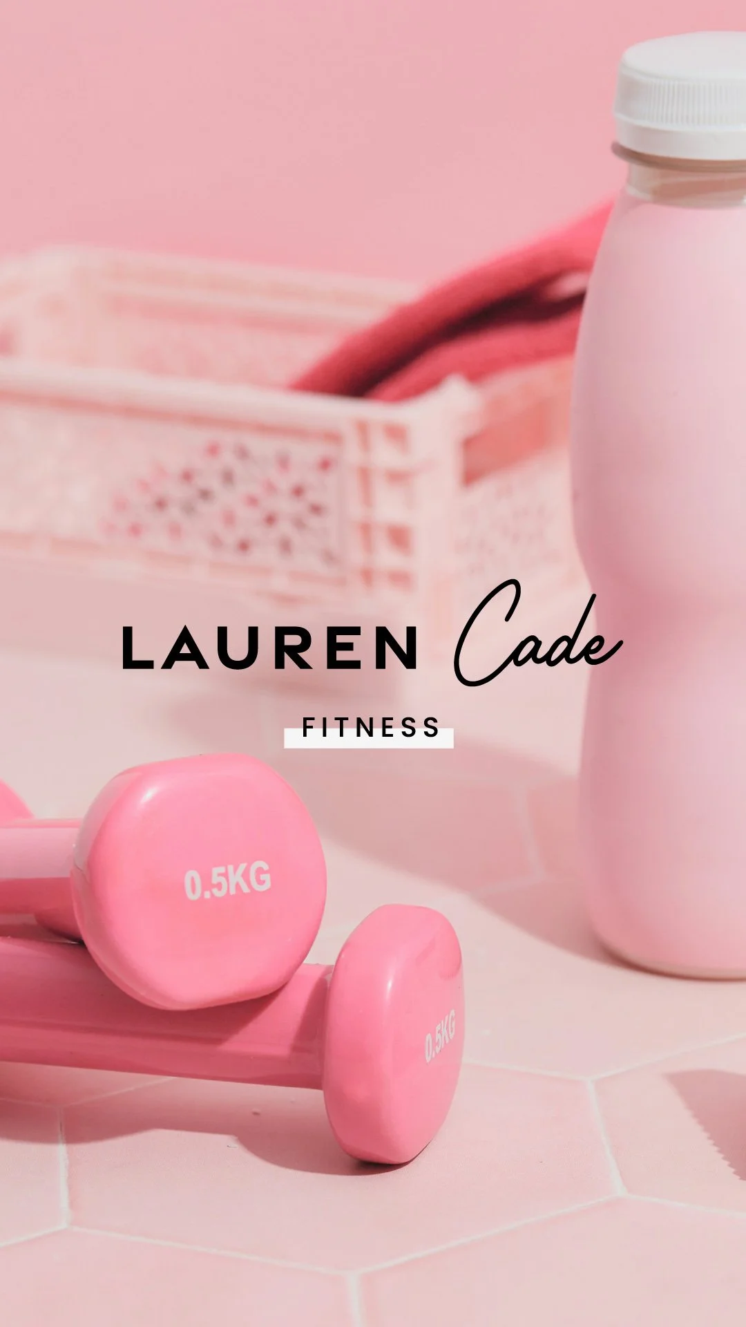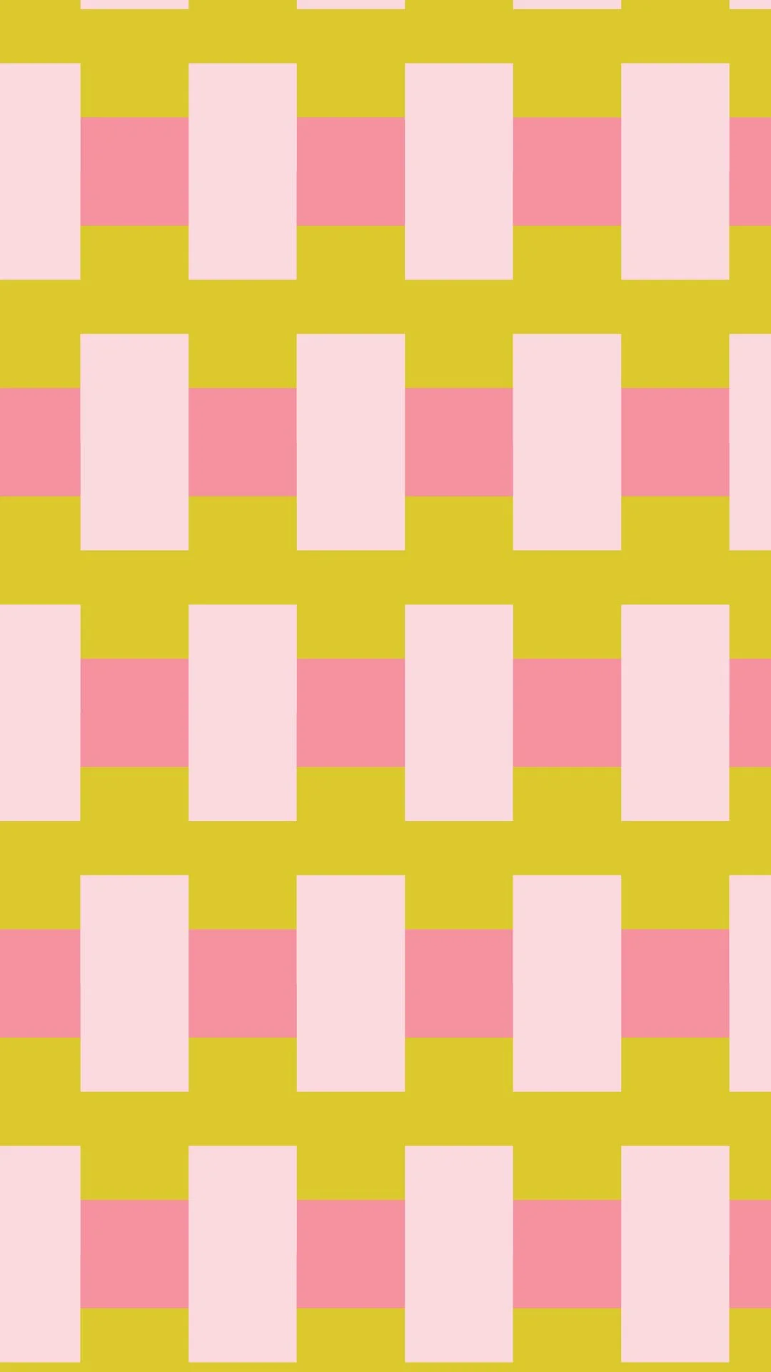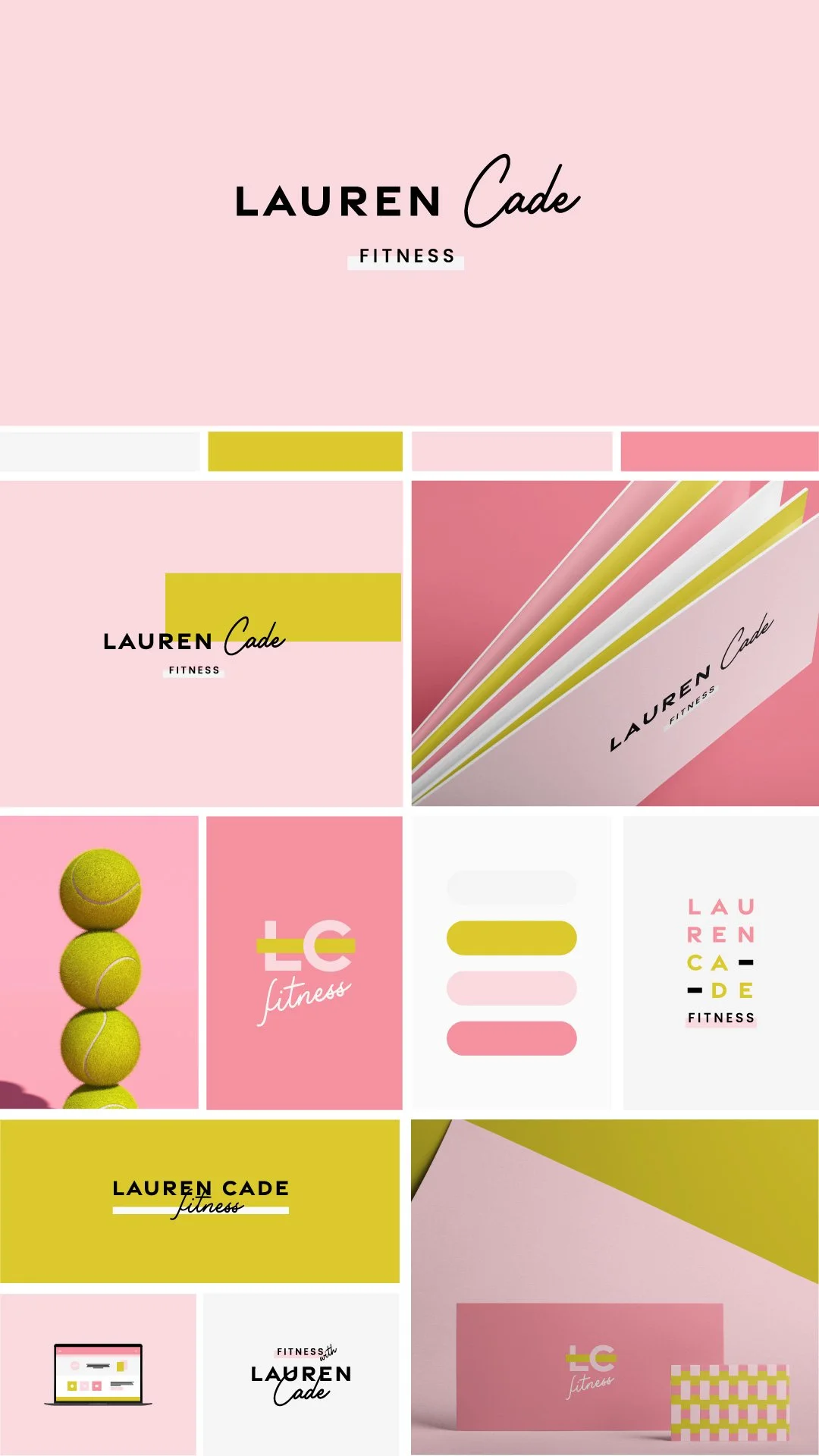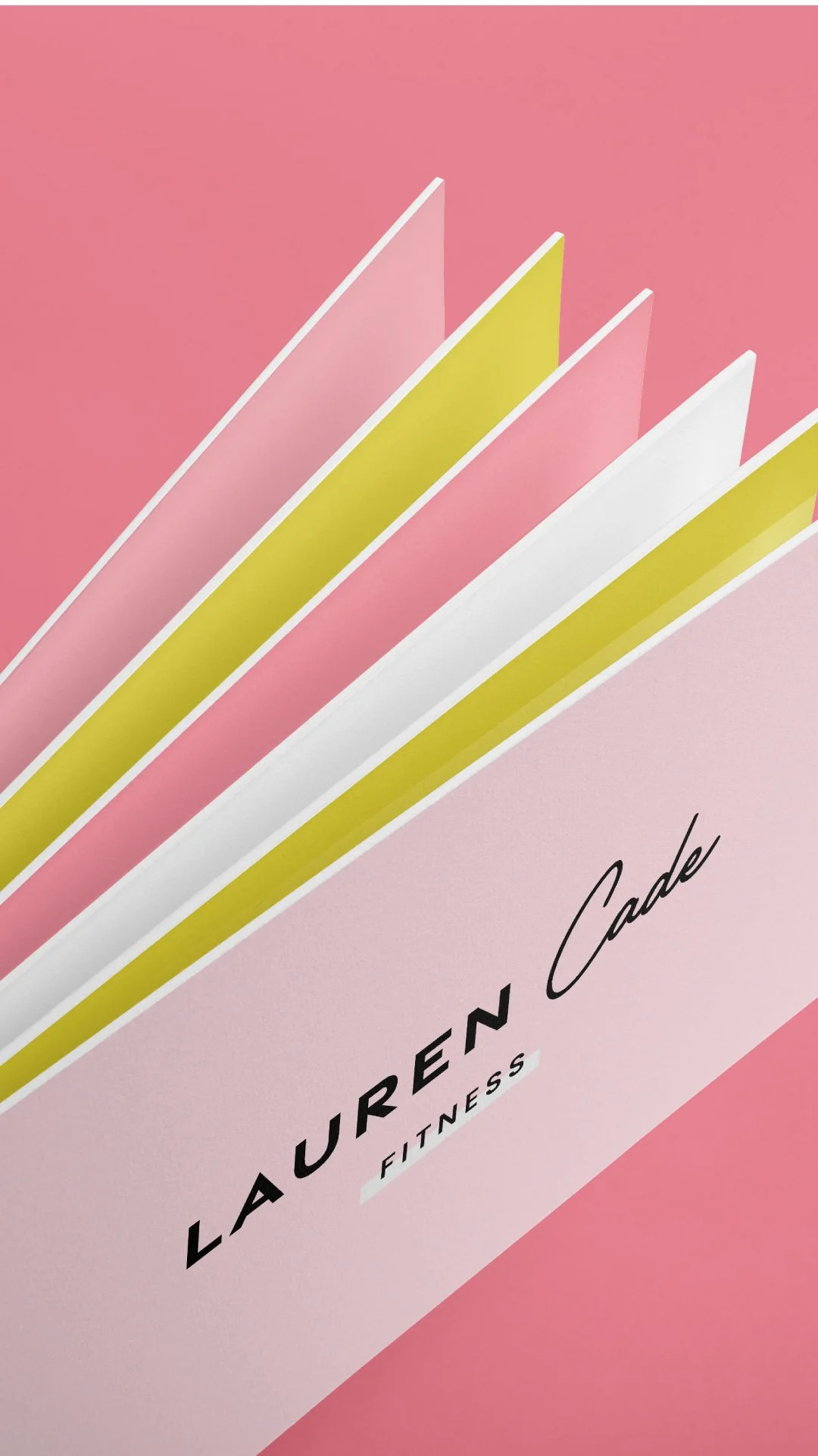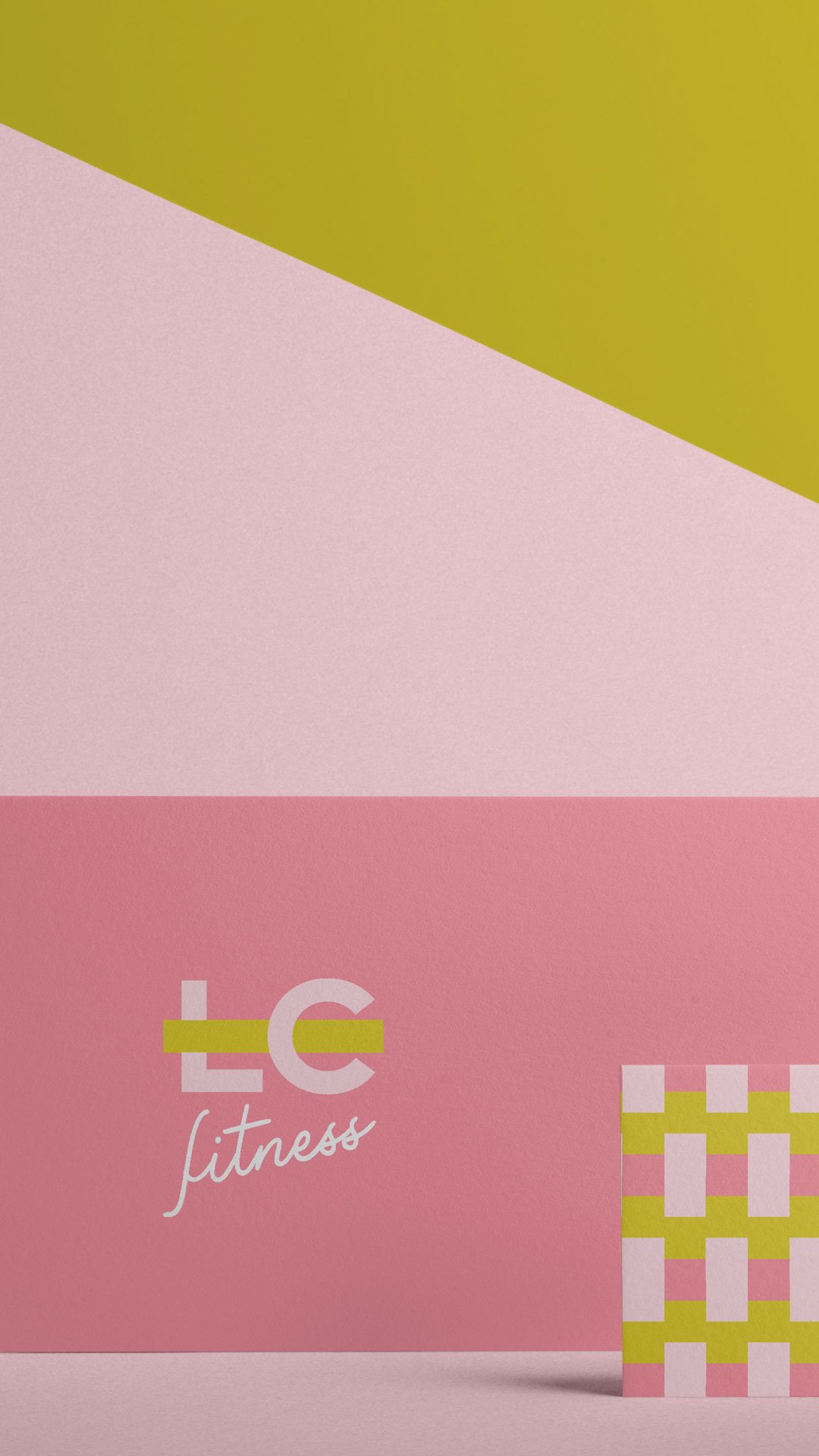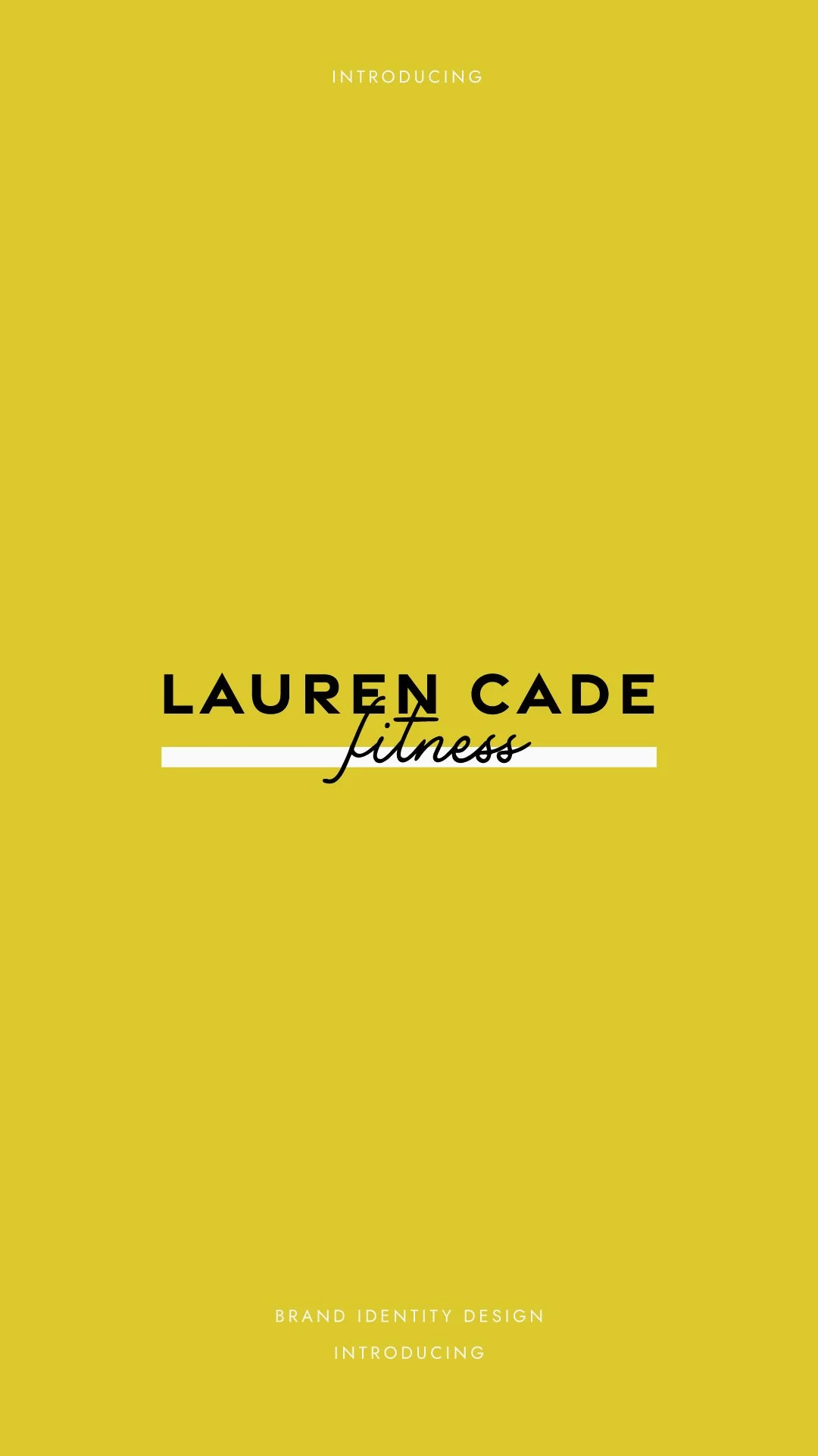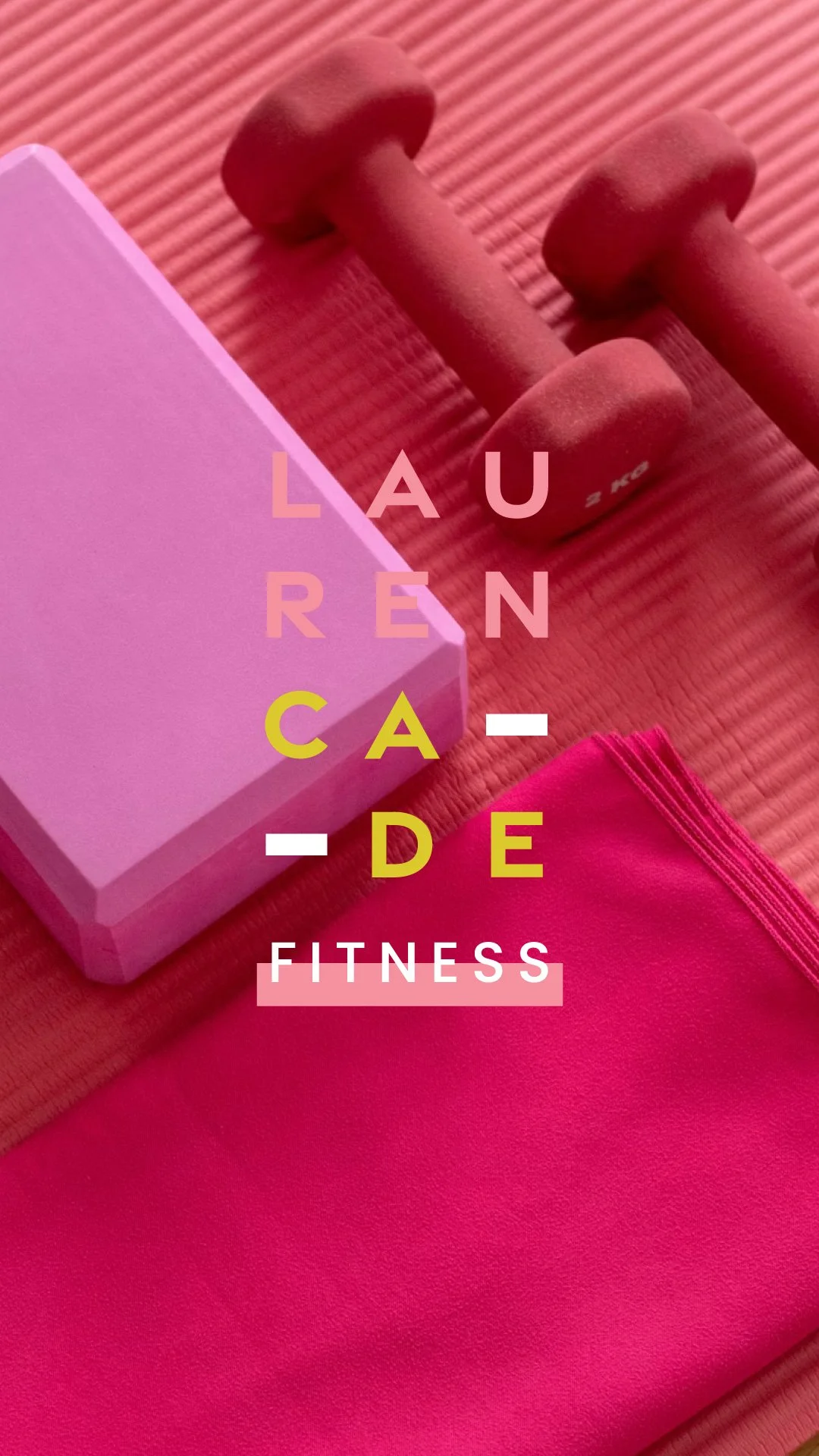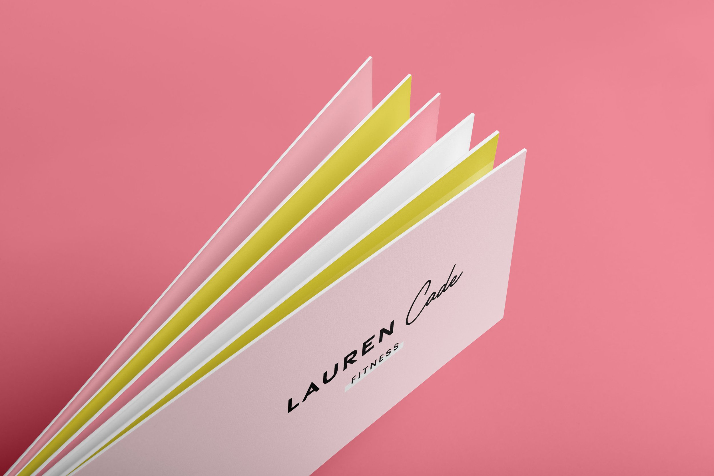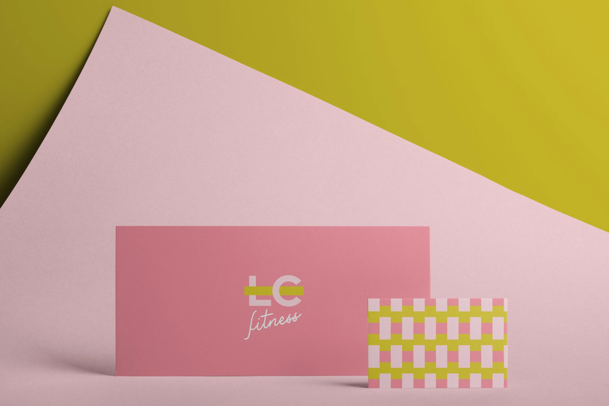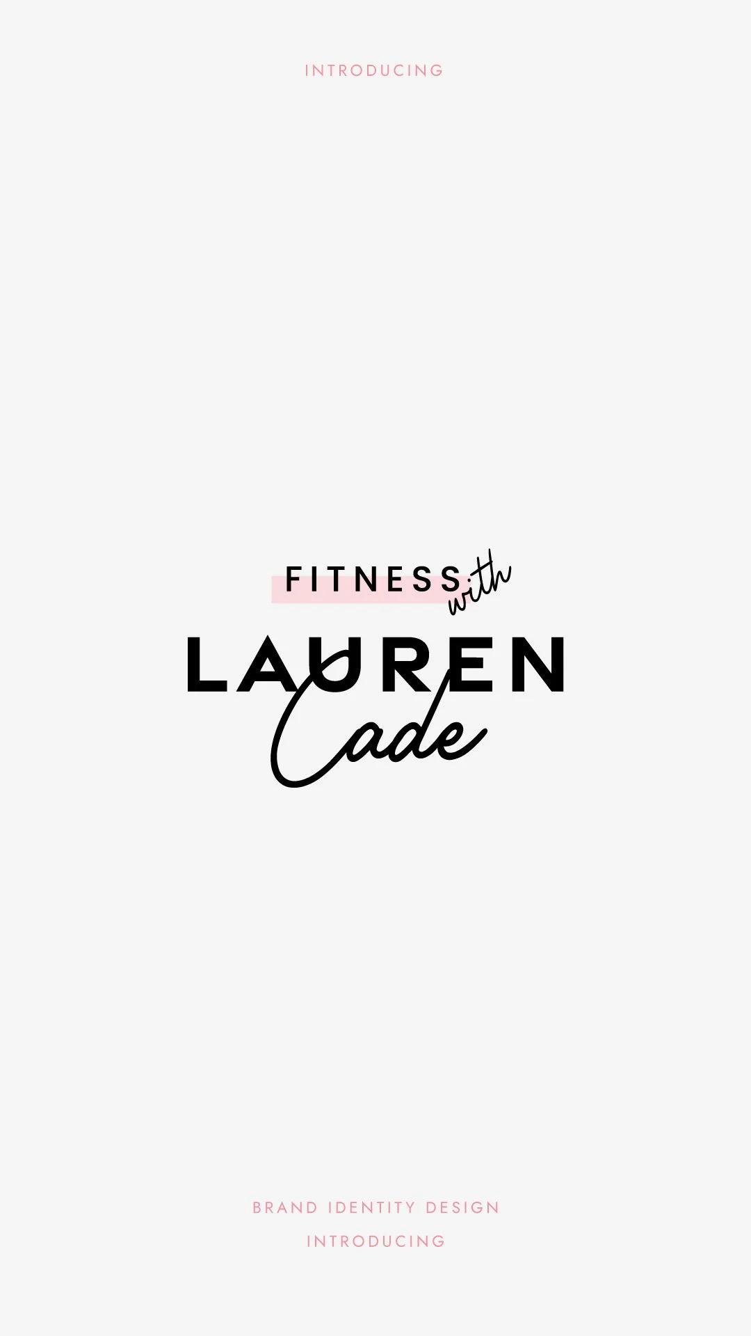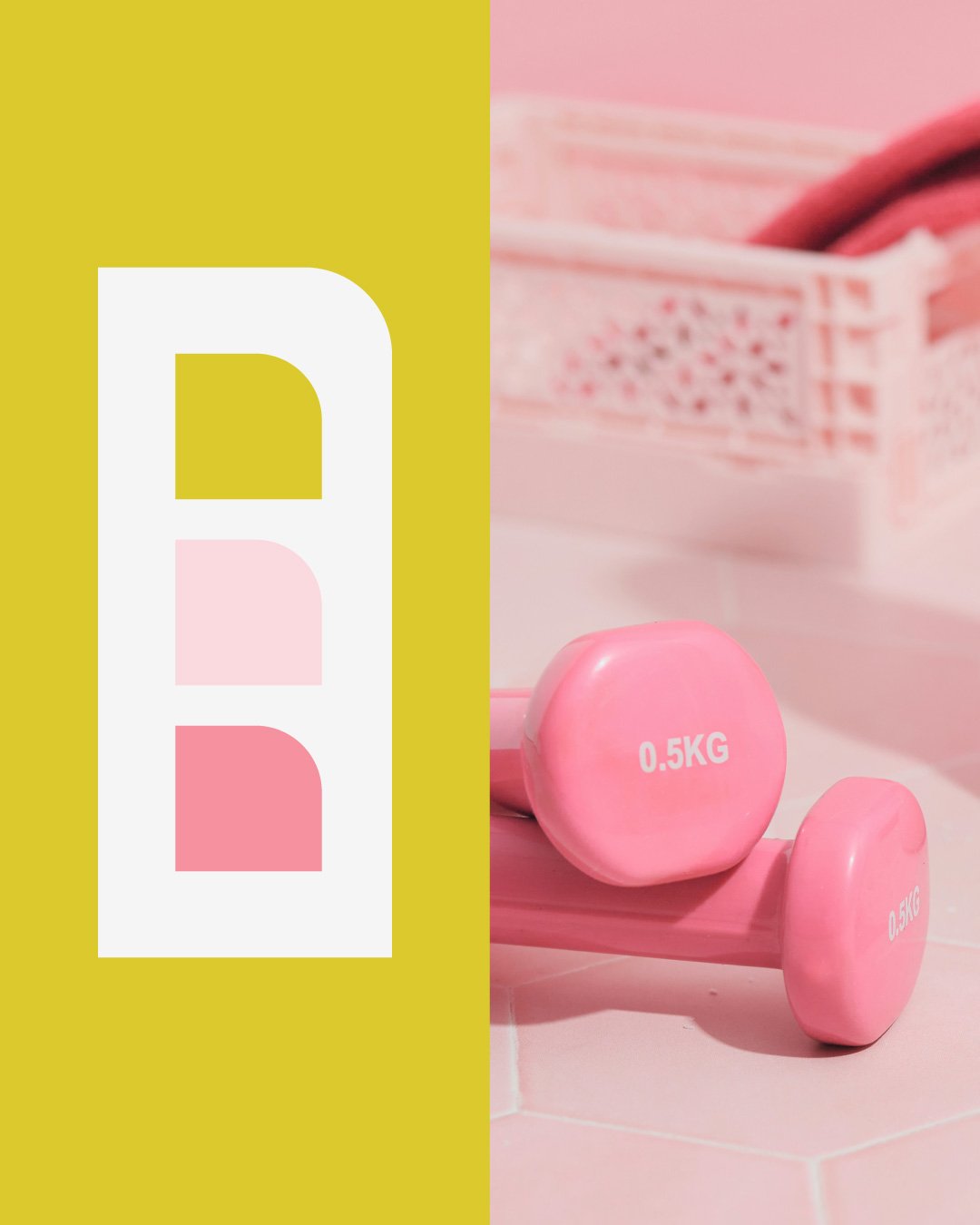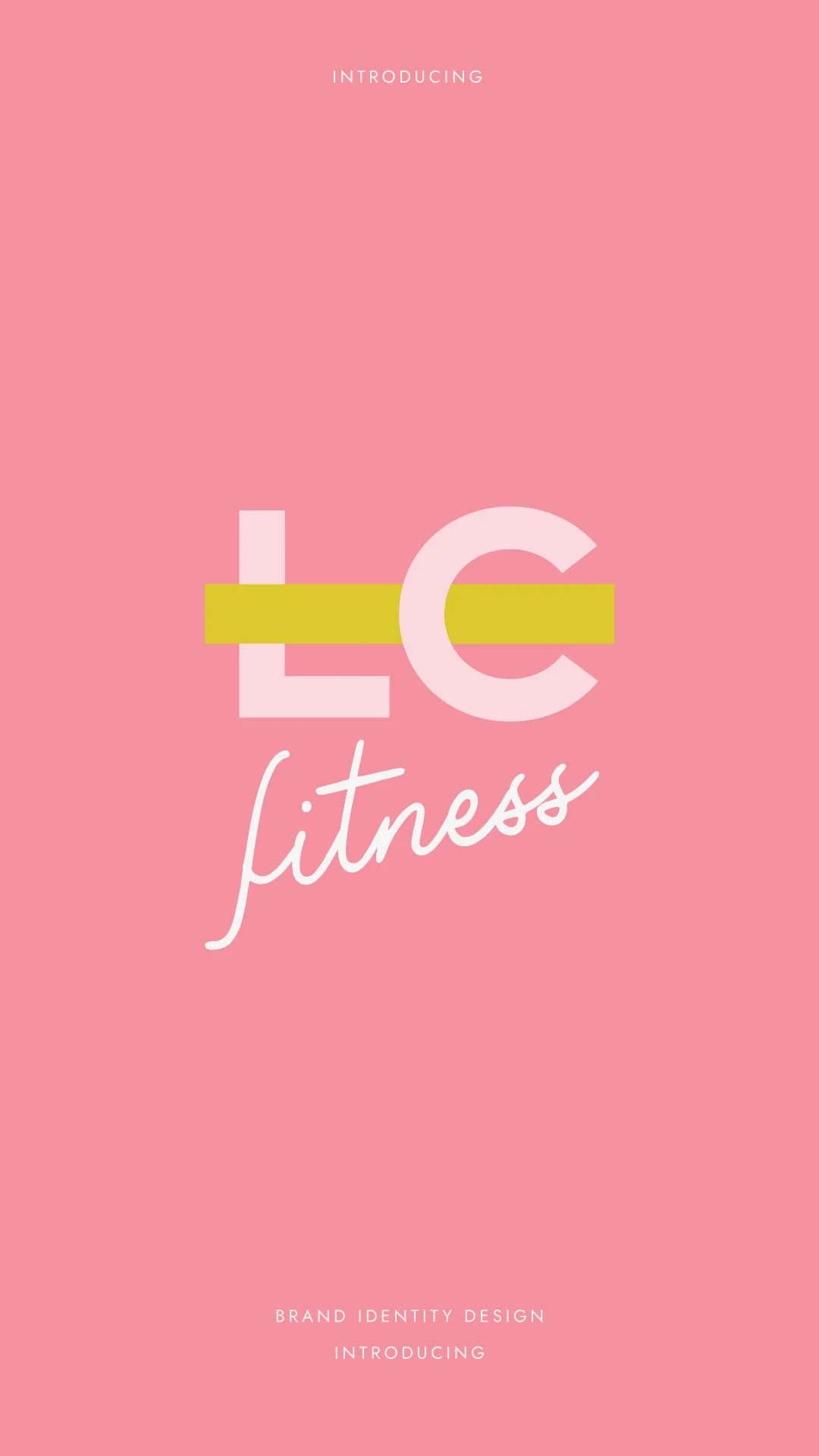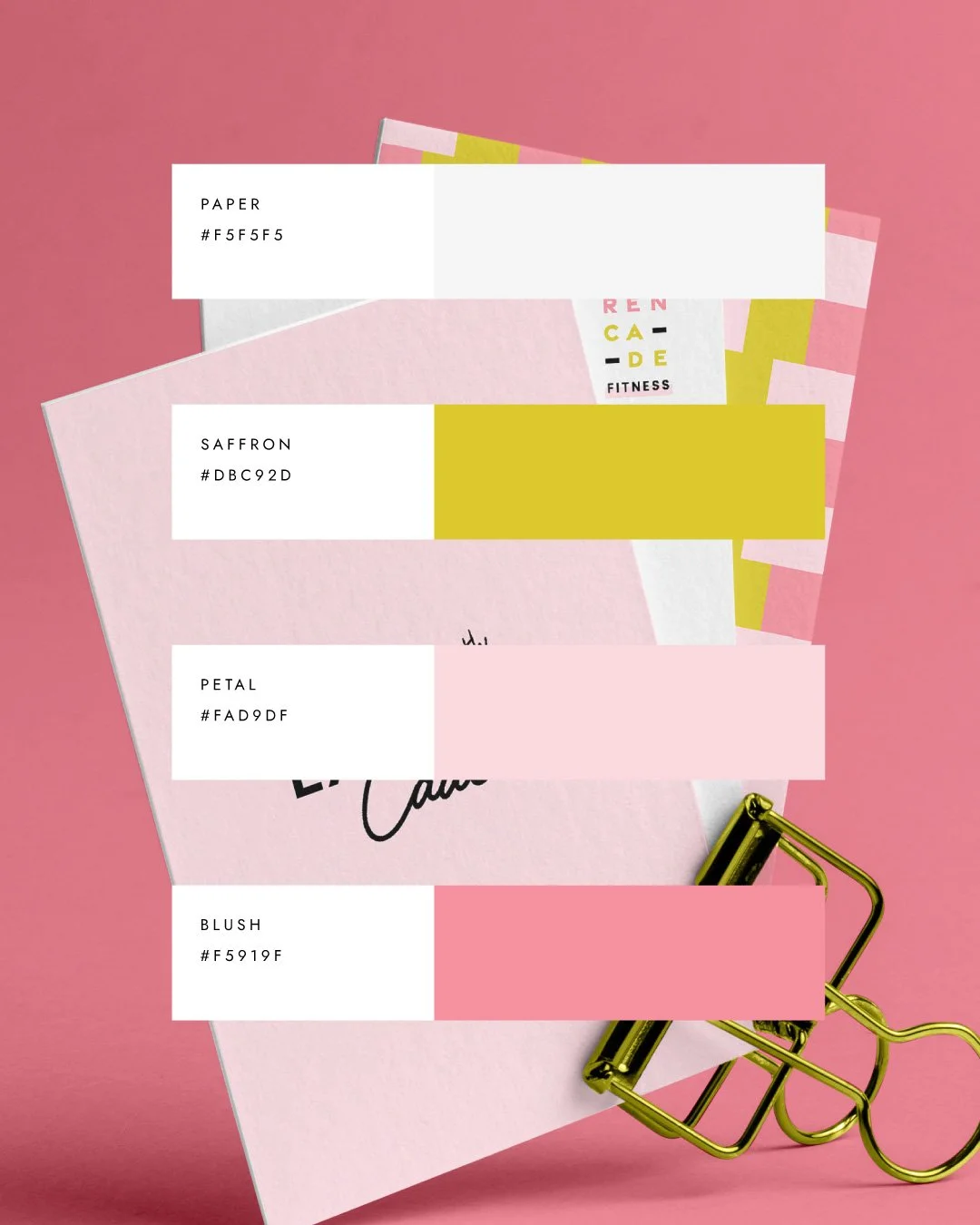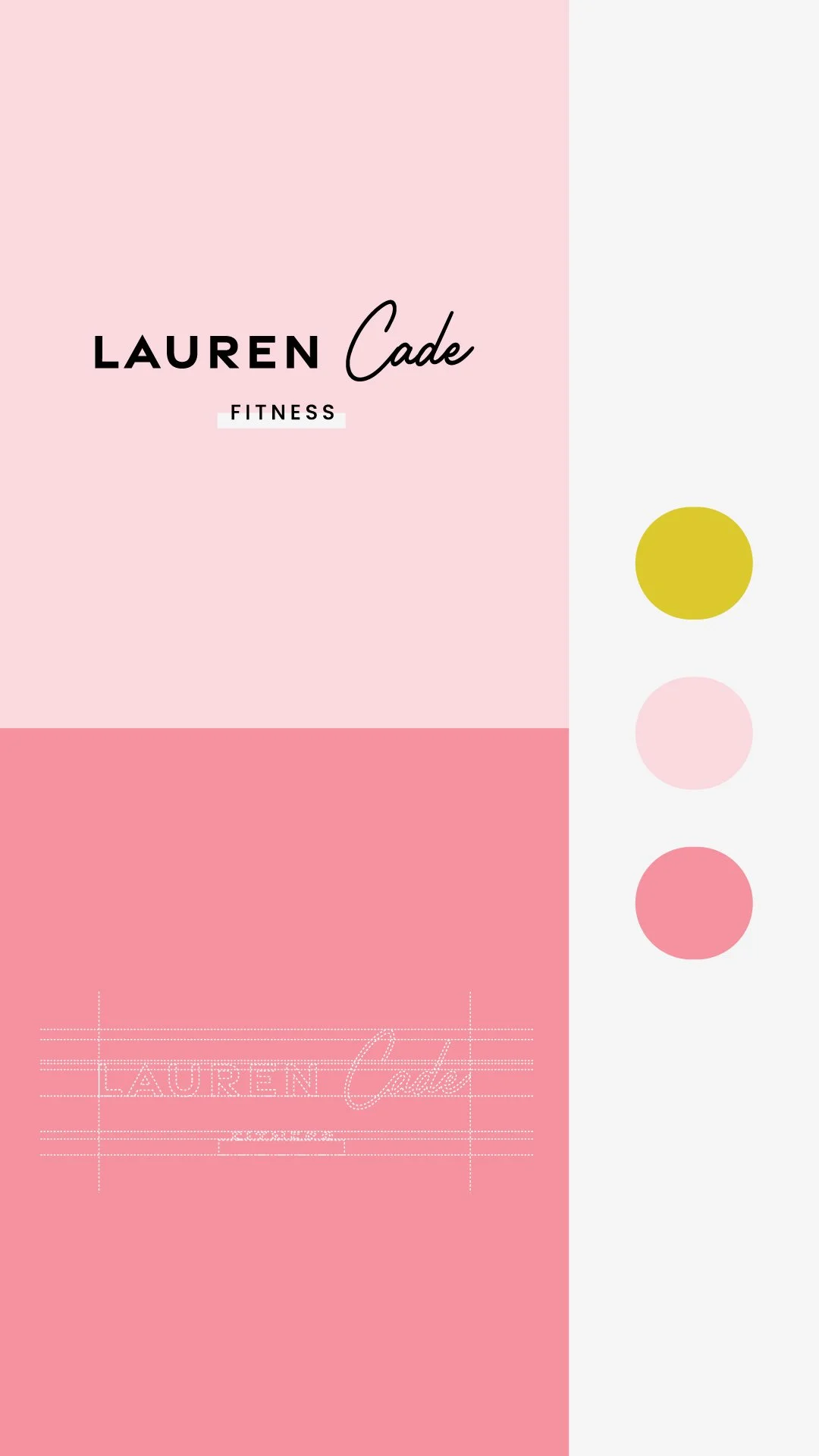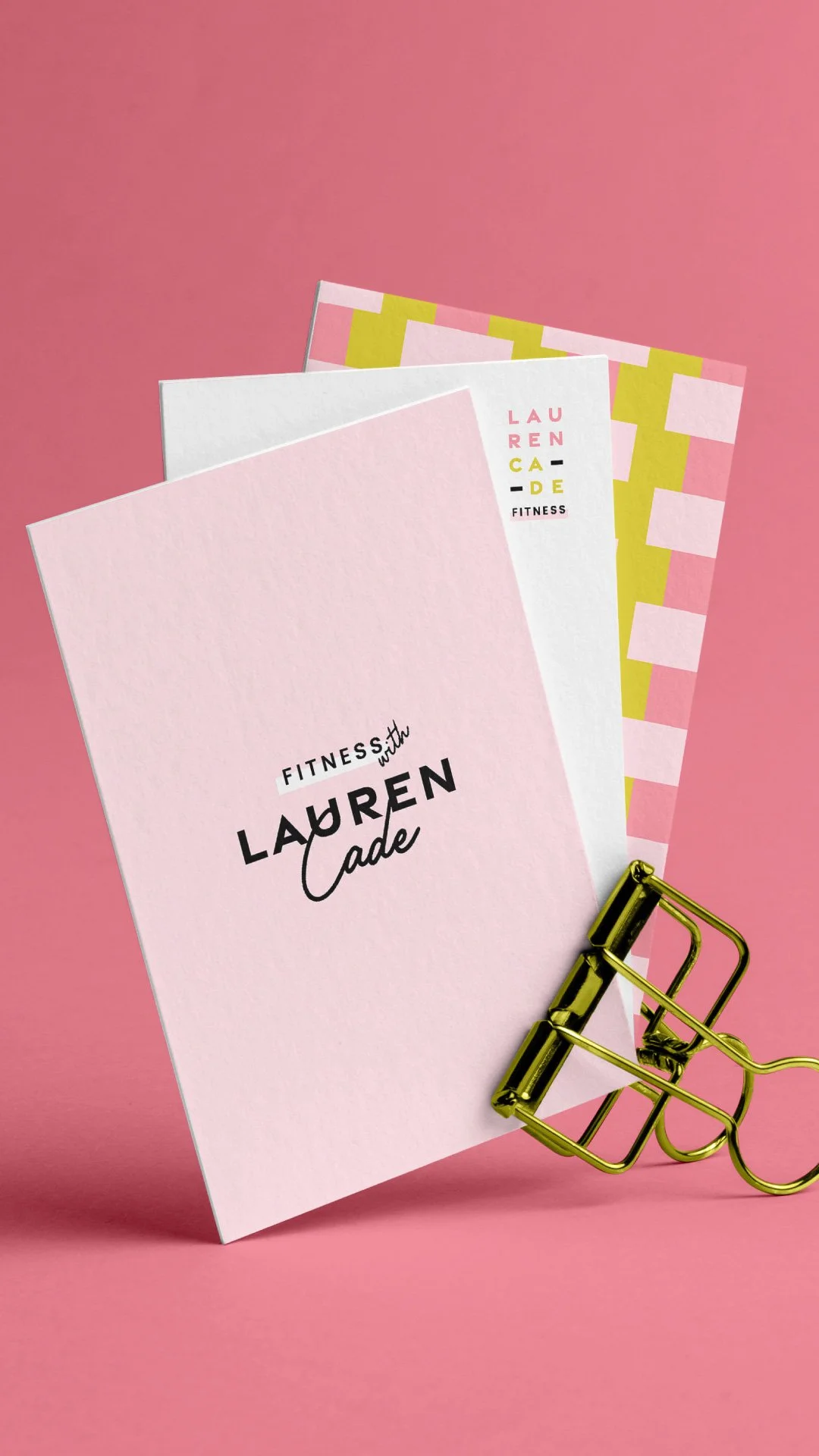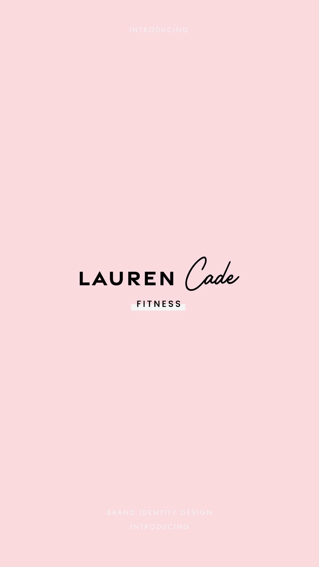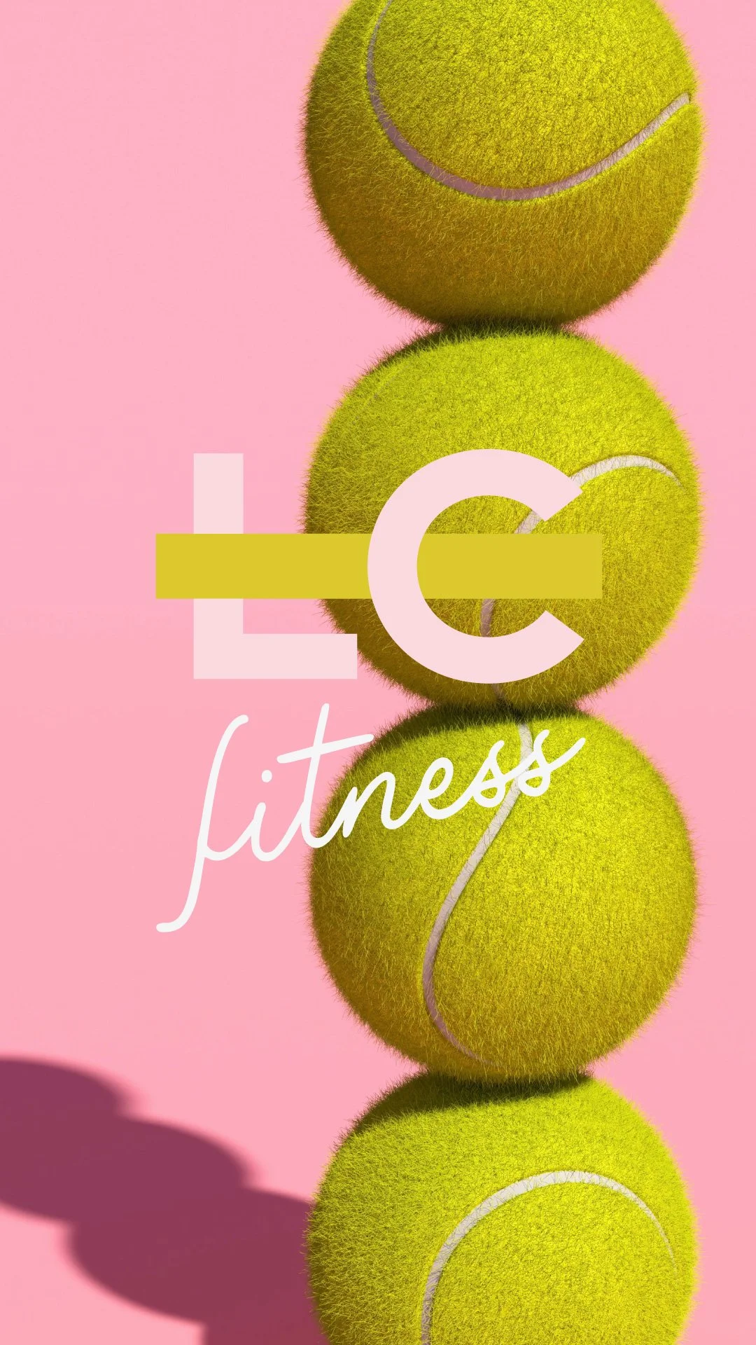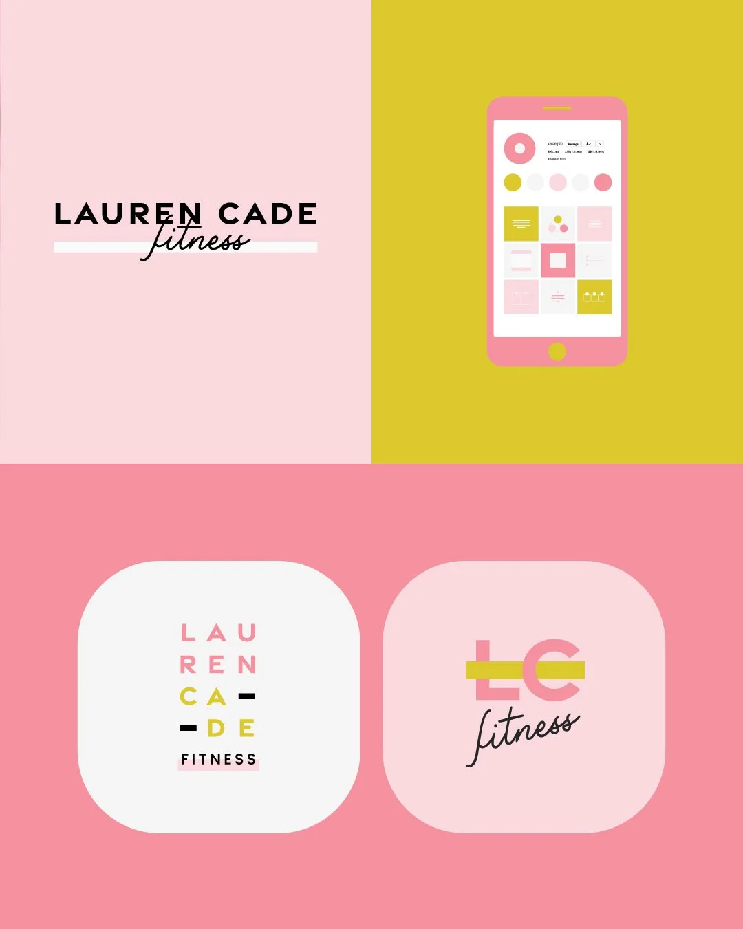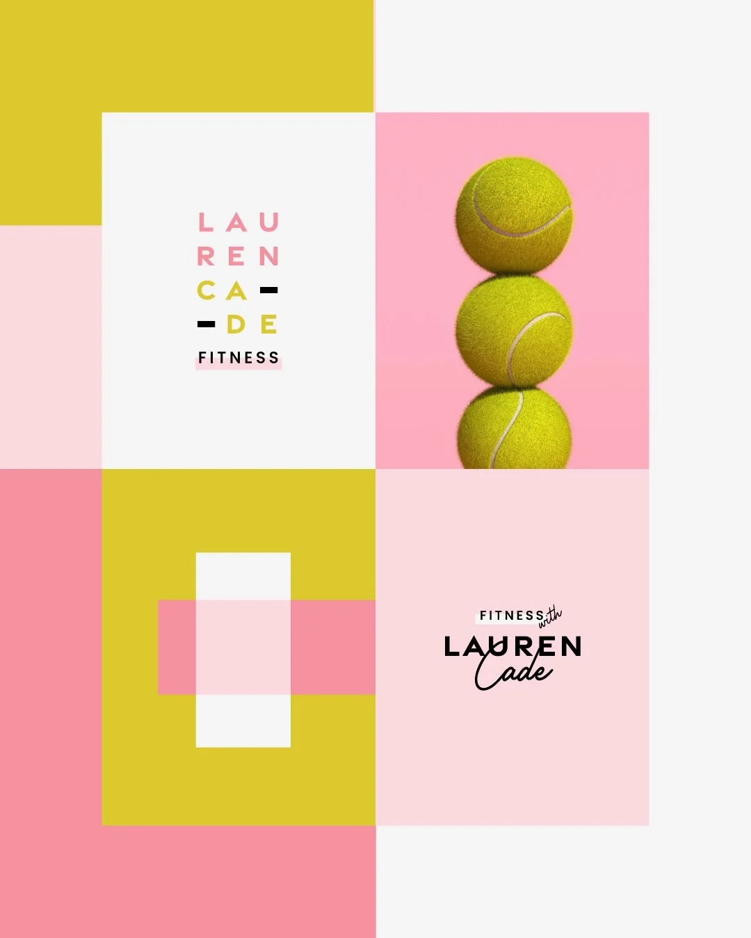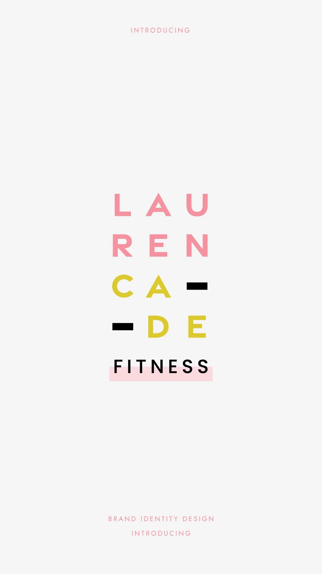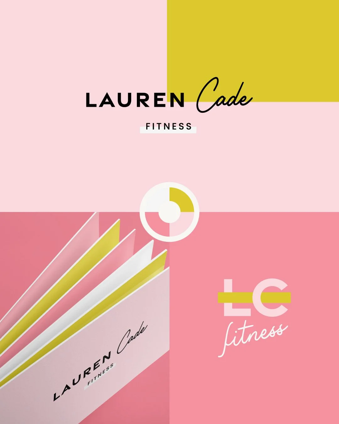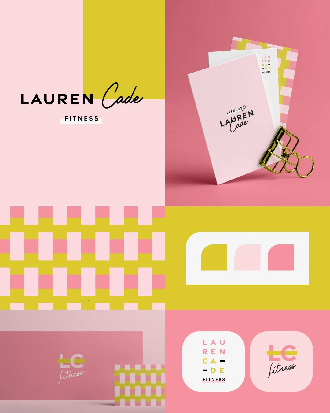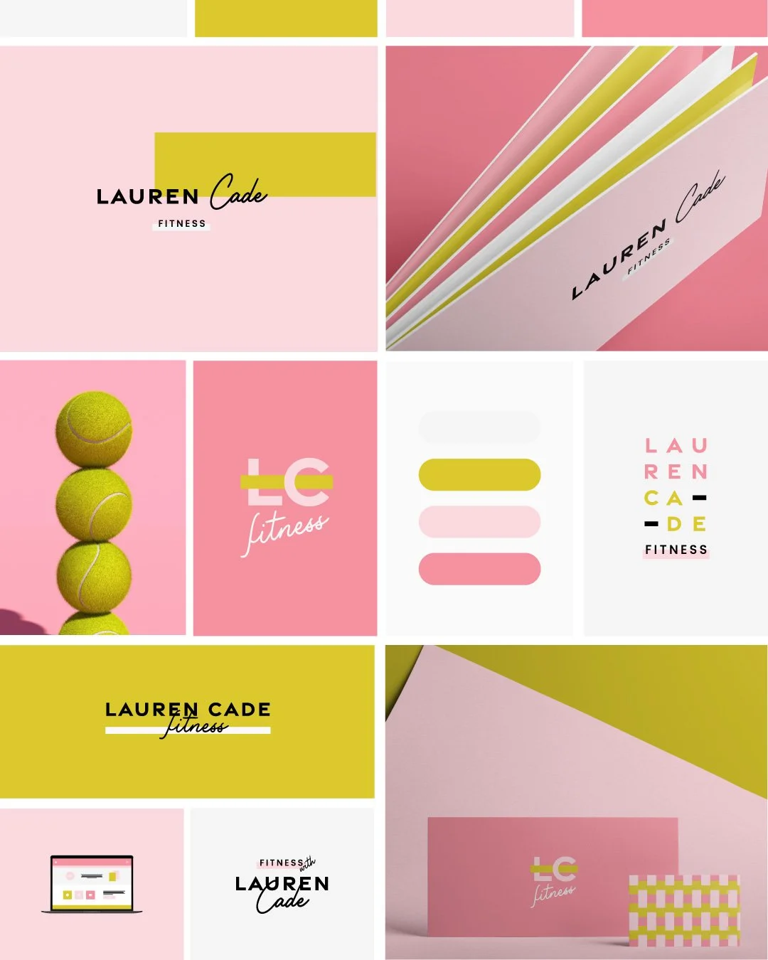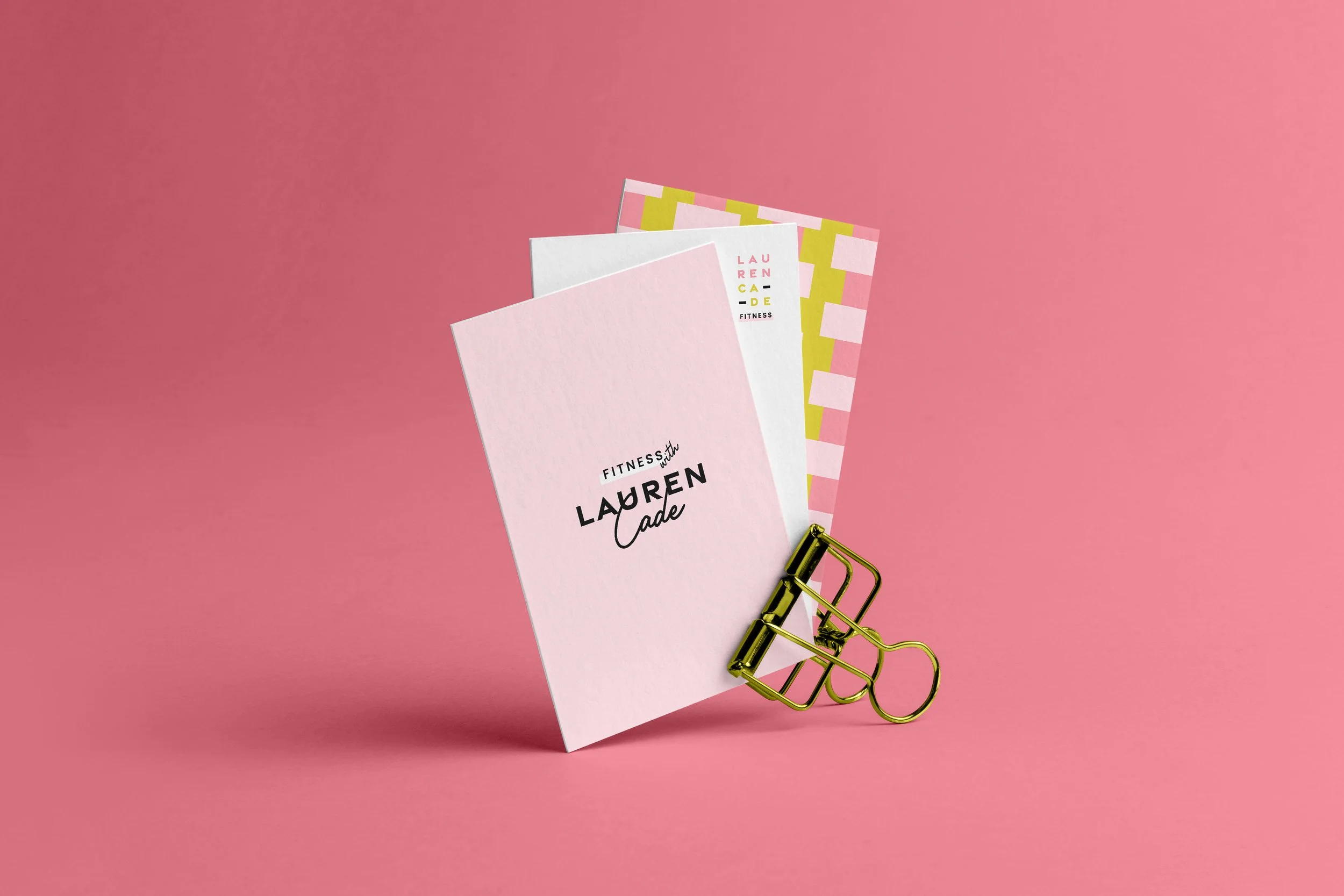
Energizing and contemporary, the visual identity for Lauren Cade Fitness utilizes a vibrant, high-contrast palette of citron yellow and punchy pinks to stand out in the wellness space. The system centers on a dynamic typographic pairing, combining a heavyweight, geometric sans-serif with a fluid, personal script that reflects a balance of strength and individual coaching. By incorporating bold color-blocking and a modular "LC" monogram that mirrors the lines of a tennis court or fitness track, the design communicates a sense of athletic precision and forward motion. The brand successfully positions itself as a modern, high-energy boutique service, utilizing clean layouts and tactile, neon-inspired photography to evoke a feeling of motivated, premium performance.